DESIGN PROCESS | BRAND GUIDELINES
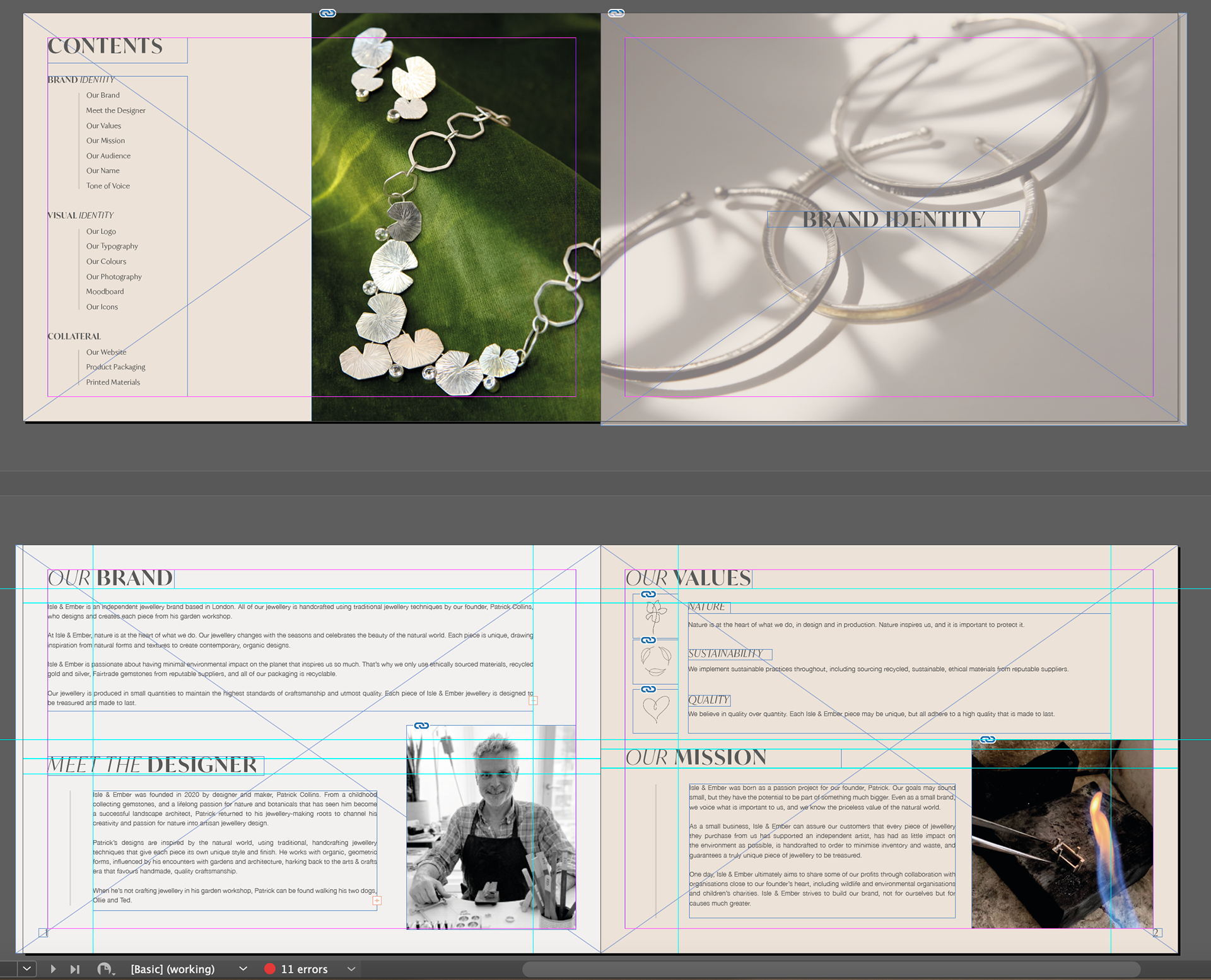
The creation of a brand guidelines document is a fundamental final outcome to this project. With many different elements to consider and communicate, I broke my guidelines into three sections: Brand Identity (introducing the brand, values, brand name, tone of voice and target audience), Visual Identity (logo, colours, typography, photography) and Collateral (product packaging and printed ephemera).
BRAND IDENTITY
Early research helped me to learn about the designer and his jewellery to inform how best to approach the branding in a way that suits his requirements as well as considering important details for when he eventually launches his jewellery ranges. I shared initial drafts regarding brand identity with the designer (in verbal as well as written format), who confirmed he was happy with them and my interpretation of the brand, therefore the final Brand Identity details haven't deviated a great deal, but have been further refined.
ABOUT THE BRAND
When establishing about the brand, it was important to consider the designer himself, his values, hopes for the brand and how to share the brand's story.
✺
"Isle & Ember is an independent jewellery brand based in London. All of our jewellery is handcrafted using traditional jewellery techniques by our founder, Patrick Collins, who designs and creates each piece from his garden workshop.
At Isle & Ember, nature is at the heart of what we do. Our jewellery changes with the seasons and celebrates the beauty of the natural world. Each piece is unique, drawing inspiration from natural forms and textures to create contemporary, organic designs.
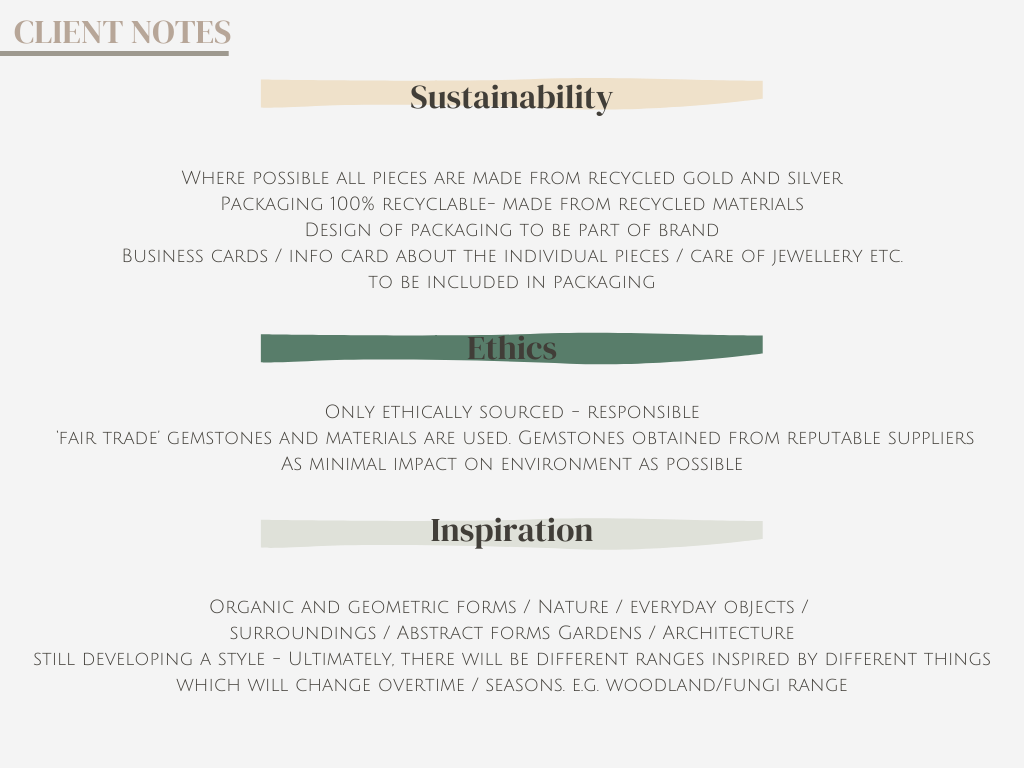
Isle & Ember is passionate about having minimal environmental impact on the planet that inspires us so much. That’s why we only use ethically sourced materials, recycled gold and silver, Fairtrade gemstones from reputable suppliers, and all of our packaging is recyclable.
Our jewellery is produced in small quantities to maintain the highest standards of craftsmanship and utmost quality. Each piece of Isle & Ember jewellery is designed to be treasured and made to last.
We believe jewellery should be as unique as the person wearing it, therefore no two pieces of Isle & Ember jewellery will be identical."
MEET THE DESIGNER
I felt that including a segment about the designer himself was a vital part of telling the brand's story. Consumers like to personally connect with brands, and this is much easier to achieve when the origins of the brand and who makes their items are communicated. This segment appears in both the brand guidelines and on the About page of the website, so that all visitors to the site have easy access to some context for the brand and what inspires its founder. Further personality was added by the inclusion of "a childhood collecting gemstones" and "walking his two dogs". A photograph of Patrick in his workshop also features, enhancing the personable nature of the brand.
✺
"Isle & Ember was founded in 2020 by designer and maker, Patrick Collins. From a childhood collecting gemstones, and a lifelong passion for nature and botanicals that has seen him become a successful landscape architect, Patrick returned to his jewellery-making roots to channel his creativity and passion for nature into artisan jewellery design.
Patrick’s designs are inspired by the natural world, using traditional, handcrafting jewellery techniques that give each piece its own unique style and finish. He works with organic, geometric forms, influenced by his encounters with gardens and architecture, harking back to the arts & crafts era that favours handmade, quality craftsmanship.
When he’s not crafting jewellery in his garden workshop, Patrick can be found walking his two dogs, Ollie and Ted."
BRAND VALUES
As what will be an independent business, it was apparent from the early stages that sustainability and quality were priorities for the designer. These positive attributes needed to be celebrated as part of the branding. I created a trio of hand-drawn iconography to represent the three core brand values- Nature, Sustainability and Quality. These icons were designed with the intention of appearing on the brand website and they have a simple, contemporary feel with adequate spacing that doesn't make the overall presentation appear busy or cluttered.
These final values are visible in both the brand guidelines and in two places on the website- on the homepage and in the About section.
✺
"Any illustrated elements to Isle & Ember’s brand are to be created in a contemporary and minimalist style, using line drawings and no colour. These icons should also be in Davys Gray (#585858), rather than black. Illustrations must be sophisticated and not childlike and err on the side of simplicity."
BRAND MISSION
In addition to the brand values, providing some context as to how the brand hopes to make a positive impact was also an important feature of the brand guidelines. While the designer is still in the early stages, outlining the aims for the brand to do good provides all readers of the brand guidelines with the knowledge of how the brand intends to be a quality, sustainable brand and potential to support charitable causes through future sales.
✺
"Isle & Ember was born as a passion project for our founder, Patrick. Our goals may sound small, but they have the potential to be part of something much bigger. Even as a small brand, we voice what is important to us, and we know the priceless value of the natural world.
As a small business, Isle & Ember can assure our customers that every piece of jewellery they purchase from us has supported an independent artist, has had as little impact on the environment as possible, is handcrafted to order to minimise inventory and waste, and guarantees a truly unique piece of jewellery to be treasured.
One day, Isle & Ember ultimately aims to share some of our profits through collaboration with organisations close to our founder’s heart, including wildlife and environmental organisations and children’s charities. Isle & Ember strives to build our brand, not for ourselves but for causes much greater. "
TARGET AUDIENCE
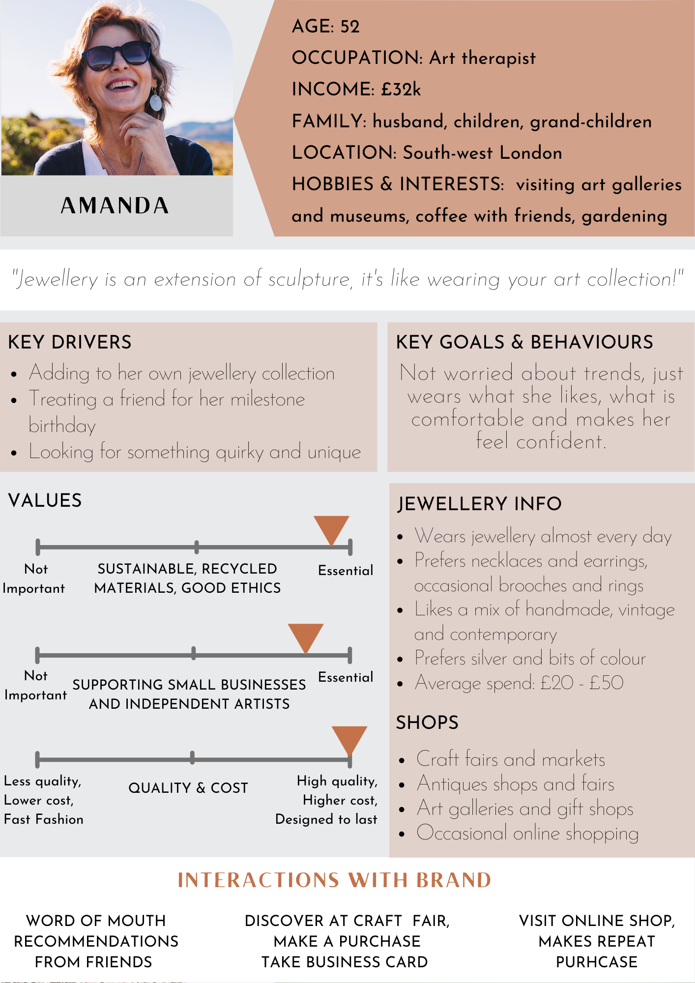
Having already conducted my target audience research in the earlier stages, these findings and the personas I created allowed me to create a series of statements that help readers of the brand guidelines to define the target consumer for the jewellery brand. While there is certainly more to the consumer than a few sentences, this allows for a quick snapshot into the target consumer who can be kept in mind when making other branding decisions, understand the consumer's wants and needs and how to communicate the brand overall.
____
"Our branding is targeted towards a broad demographic of female consumers between 22 and 50s. More important than age though, it’s our audience values that matter.
✺
The Isle & Ember consumer is a conscious shopper. She likes to support small businesses and is part of the shop local and sustainable movements of today.
✺
The Isle & Ember consumer loves jewellery that is unique. She wears jewellery herself, but also loves to treat her friends and family with gifts that are crafted with passion and made to last.
✺
The Isle & Ember consumer loves nature. She appreciates the beauty of nature, from walking and being outdoors, to gardening, botanical designs and a love of houseplants.
✺
The Isle & Ember consumer uses online to shop, and researches brands before she buys. While it is important to her that jewellery is affordable, she does not compromise on quality or style.
✺
The Isle & Ember consumer shares our values and we aim to build honest and personable relationships with our audience across our channels. "
TONE OF VOICE
Tone of voice appears throughout a brand, and establishing a voice that was reflective of the designer and his jewellery was vital. The words we say are just as important as the visual aspects of our brand. Our tone of voice strengthens our relationship with our consumer, creating clarity and consistency across the brand, ensuring that no matter who is writing or saying the words, our message is unified.
The following is a breakdown of the brand's tone of voice:
✺
Personable & Caring:
We are a small business, not a corporation with lots of staff and automation. Our tone of voice is authentic and builds a personal connection with our audience. Interactions on social media are a great way to communicate with our audience directly. Respond to comments promptly and keep things positive.
✺
Professional & Respectful:
Communicate the brand in a professional manner. Interact with our audience directly, and maintain professionalism at all times. Avoid trend words, slang terms and cursing.
✺
Honest & Trustworthy:
Our language is transparent and genuine, particularly when we speak about our values and issues of sustainability and the sourcing of our materials. Know that we are not perfect, but we are taking all the necessary steps to be as sustainable a brand as possible.
✺
Romantic & Nostalgic:
Incorporate storytelling language across the brand. Be descriptive and evocative through the use of language that inspires our audience and gives a greater emotive resonance with our jewellery. Isle & Ember is inspired by nature, a subject with endless possibilities to get creative with our writing.
RULES FOR WRITING
When writing any copy as part of the Isle & Ember brand, from customer emails to social media and website copy, it is important to keep our tone of voice in mind.
Example: Product Descriptions
When it comes to product descriptions, of course it is essential to cover the basics in terms of describing the jewellery, for example, its material, colour and size. But we can do more than that. Incorporate narrative language to your copy that will tell a story to our audience. Keep in mind the inspiration behind that piece of jewellery, and use language that evokes a connection with the reader. Draw attention to the process, such as the technique used and whether the materials are recycled or ethically sourced. You can also provide the consumer with a styling tip on ways to wear the jewellery. Product descriptions should not be purely descriptive, but also aim to tell a short story about each item of jewellery and what has inspired it.
✺
Example:
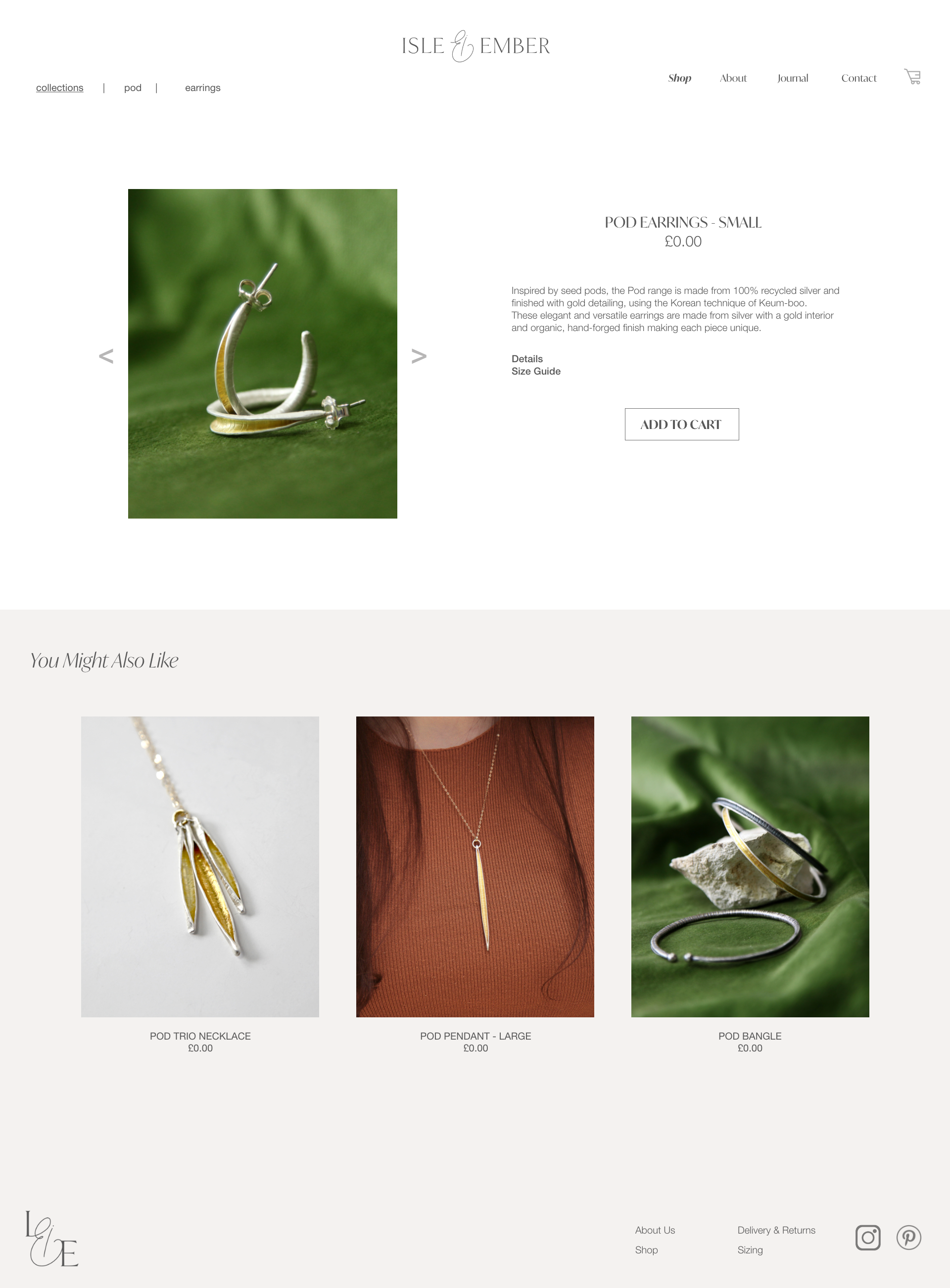
Inspired by the seed pods of crisp autumnal mornings, the Pod range is made from 100% recycled silver and finished with gold detailing, using the Korean technique of Keum-boo. These elegant and versatile earrings are made from silver with a gold interior and organic, hand-forged finish making each piece unique. This beautiful set of hoops can be worn on their own for a chic look, or pair up perfectly with other pieces in the Pod range, like our Pod necklace.
BRAND NAME
For the naming process, see Part 1: Research & Development.
The brand name was finalised after a survey was conducted to gain audience feedback from a shortlist of names.
Isle & Ember was the favourite from the survey results, so seemed the most suitable name to pursue.
Other names were dismissed primarily because they were unavailable as domain names or already existed as businesses. To check availability, I ran a search for domain name availability and on Instagram as a username, as these will be the two most important platform for the brand when it launches. Isle & Ember is currently available as both a website URL and an Instagram username (@isleandember) and has no connotations that would detract from the brand's overall identity.
✺
MEANING
Isle - Connotations: island, land, green, nature
Ember - Connotations: fire, warmth, gold, orange, forged, jewellery making, craftsmanship
The words Isle & Ember can also be made when creating acronyms of the designer's daughter's names,
Isabel Rose and Lillie Mai.
VISUAL IDENTITY
LOGO
A logo is one of the first visual assets a consumer sees, and has the potential to make the brand memorable and iconic. Ensuring a strong logo that creates an instantly recognisable symbol and reflects the brand is a difficult but essential task.
INITIAL LOGO DEVELOPMENT
Some early logo designs were created when a name for the brand was still being decided. While still selecting the best brand name, I thought that drafting some logos may help to bring one name to the forefront, if a strong logo was created from it. When researching logos early on, I sought much of my inspiration from Pinterest, seeking minimalist, contemporary branding that incorporated nature somehow.
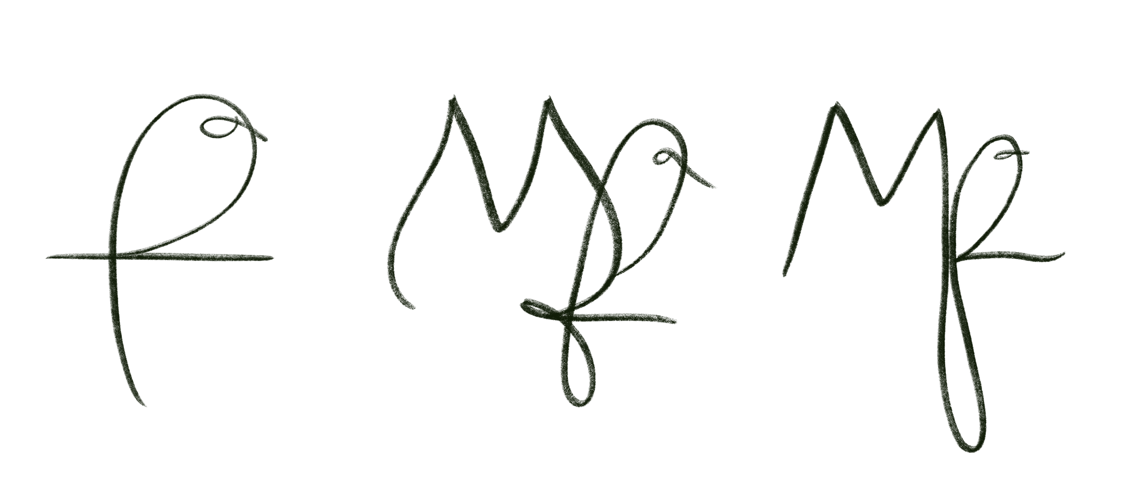
First of all, I sketched some logos with a bird and the MF initials, for another potential brand name, 'Maibel & Finch' (left).
Early logo experimentation used online design tool Canva as this allows you to make graphics quickly and easily. This meant I could experiment with colours, fonts and motifs without spending too much time or get too deep into the design process too early on. I created the first logos using potential brand names 'Isalie' and 'Maibel' alongside nature motifs and the soft green and neutrals colour palette identified as a preference by the designer in earlier research development (see below).
ISLE & EMBER - INITIAL LOGO DESIGNS
Once the name Isle & Ember had been selected, creating a logo was the next step. I started the brainstorming process by drafting up some logos using the templates on Canva. While none of these logos would be used, it was a good exercise to carry out as it allowed me to consider colours, compositions and type faces that might work together. These early stage logos put an emphasis on natural forms, such as the sun and the land. There was potential to incorporate natural elements into the logo, however I felt that it caused the logo to be too literal and felt it wasn't necessary for the nature element of the brand to be too heavily incorporated. This exercise did however confirm my intentions to use orange and green as part of the brand colours as they are very complimentary.
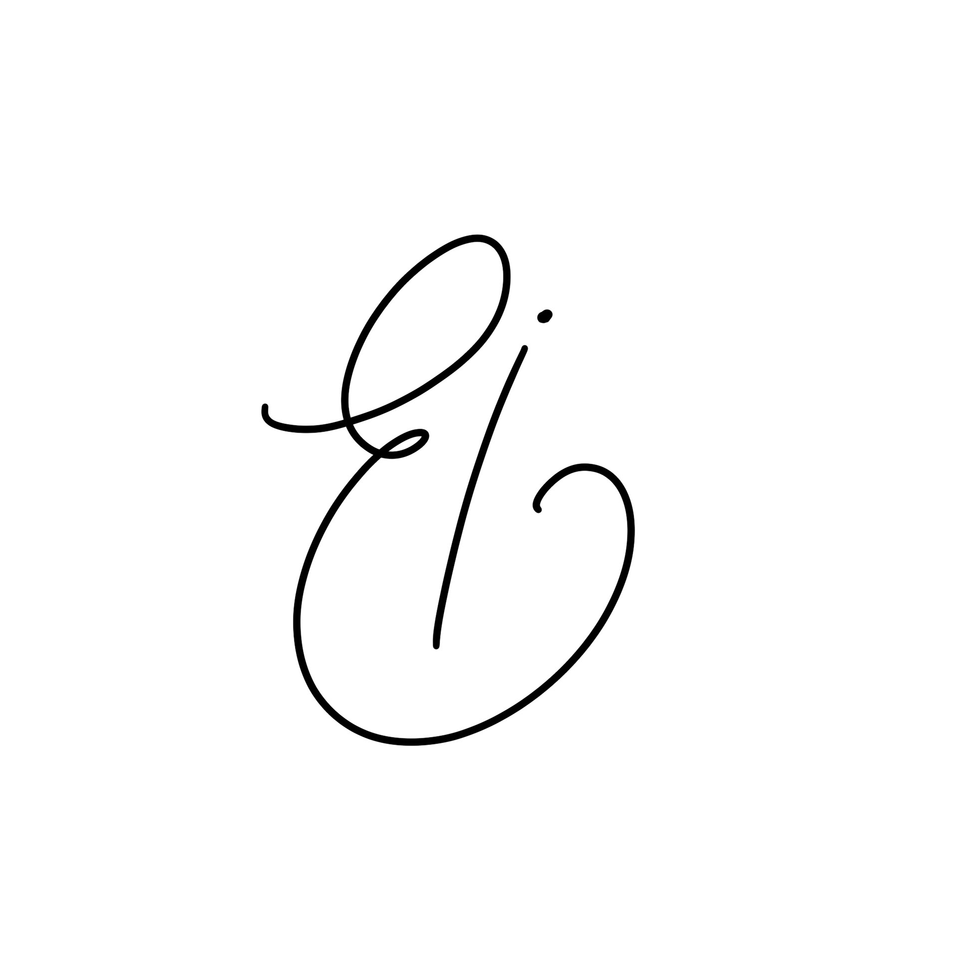
AMPERSAND
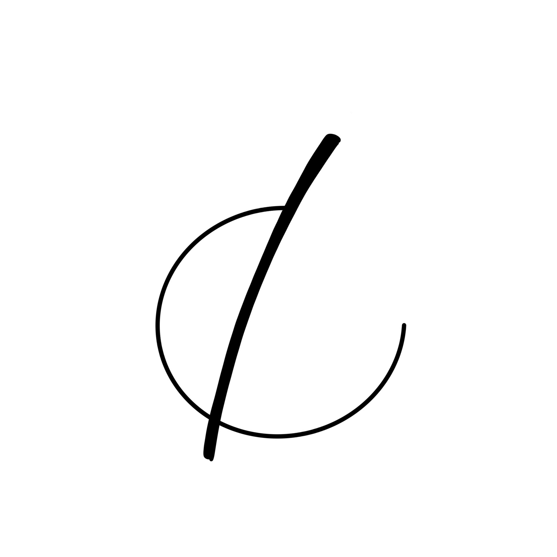
Research of other jewellery brands, particularly from independents or small businesses tend to prioritise a type face rather than creating an emblem, and their results are successful. The intention therefore was to create a logo that can be viewed in full, as well as condensed down. Typeface would be prioritised and would then influence the incorporation of an emblem into the logo. I noticed that when I was writing '&', that the letters I and E make up its construction, and felt that this might be a good direction for creating the brand's emblem.
I'm aware that the ampersand is quite commonly used as a form of emblem in branding, however felt that in this instance, with the brand initials of I and E naturally making an ampersand shape, it would be an effective solution and created with purpose.
I started drawing a selection of ampersands on Procreate, some based on examples found online. I tried to only work with styles that clearly used an I and E construction, and as you will see some were more successful at this than others. This reduced my selection down and I also consulted with the designer during this process.
FINAL TWO EMBLEMS
Having drafted up several variations of a logo creating an ampersand with the letters I + E, these two variations were the most popular choice amongst a selection of people I asked for feedback. These logos were favoured as the I and E was legible in both designs, however they both evoke a different look and feel which may determine the overall direction of the brand.
The first is more contemporary, stylised and masculine, but risks not being legible as an ampersand. The second is more traditional and feminine, but does replicate an ampersand more effectively.
These logos were further developed to decide which would be the best to pursue as a final logo design.
CHOOSING LOGO FONT
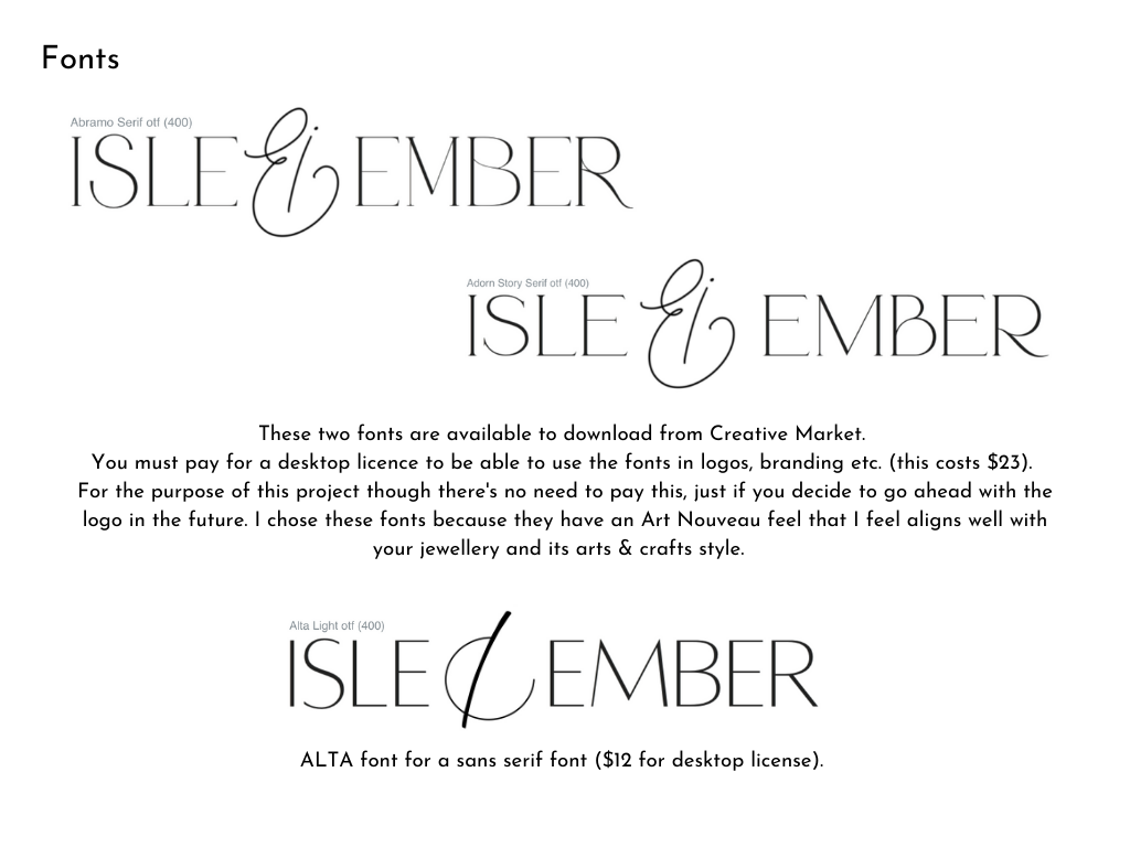
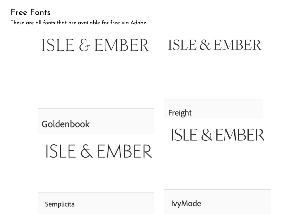
In order to help decide with which emblem to use, considering different fonts and how they may work with the emblems helped to refine the logo further. To source fonts, I used searched Adobe TypeKit for free fonts, as well as looking at Creative Market for bespoke fonts which would need to be paid for to use. My search criteria including looking at a mix of serif and sans-serif typefaces, as well as some more quirky, ornate fonts that might work for a logo. The fonts from Creative Market were more unique and distinctive and carried an Art Nouveau quality that suits the brand, however ultimately myself and the designer decided that using a free font and simpler typeface would be better and poses no potential licensing risks.
After pairing the potential emblems with various fonts, I selected Adobe Goldenbook is the best choice for the logo typeface. The font provides a classic, simple feel that has a timeless quality and is easily legible at a smaller size.
CHOOSING THE FINAL LOGO
Now that the logo's typeface was selected, choosing the right emblem to incorporate into the logo was the next step. I created logos with the final two emblems to be considered.
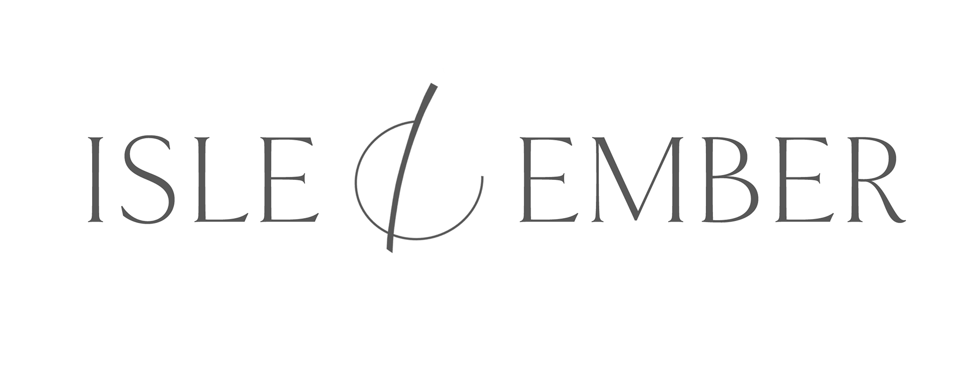
Having experimented with the two variations and receiving feedback from various people and the client himself, I decided to use the second option as the final logo design as it offered better legibility and more potential to be adapted to suit different mediums.
FINAL LOGO VARIATIONS
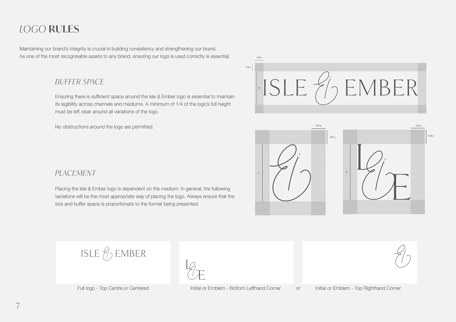
The final logo has three variations:
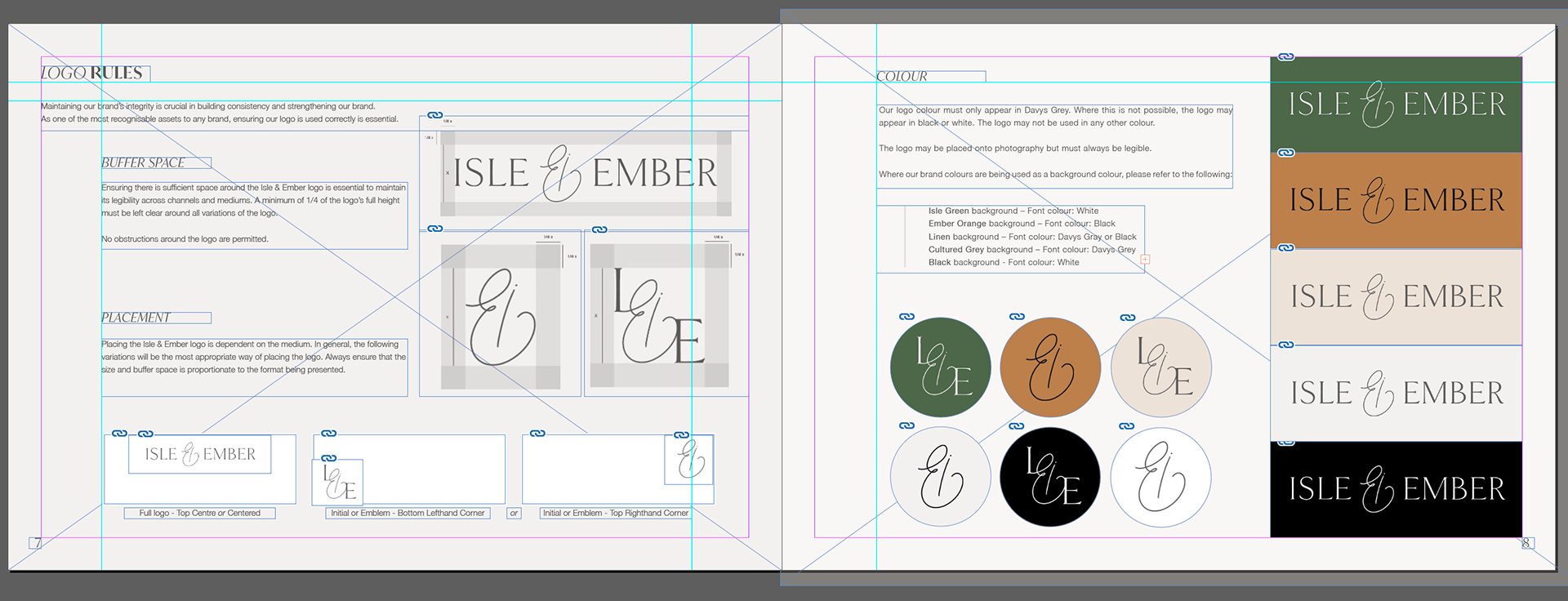
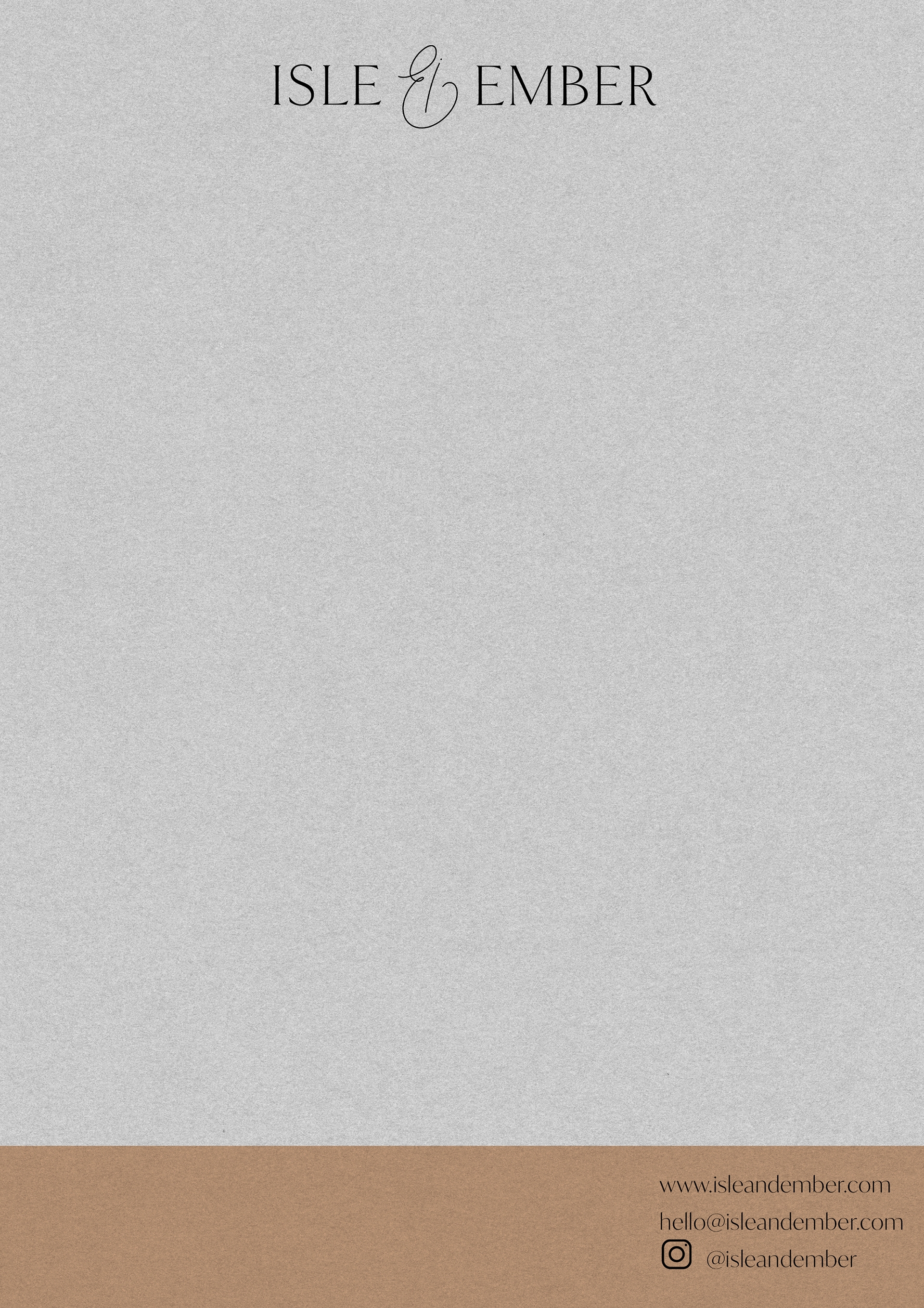
FULL – The full logo contains Isle & Ember with the emblem in the centre. This is how our logo is most often used. You will find our full logo on our website, packaging, business cards and marketing materials and headers for printed letters.
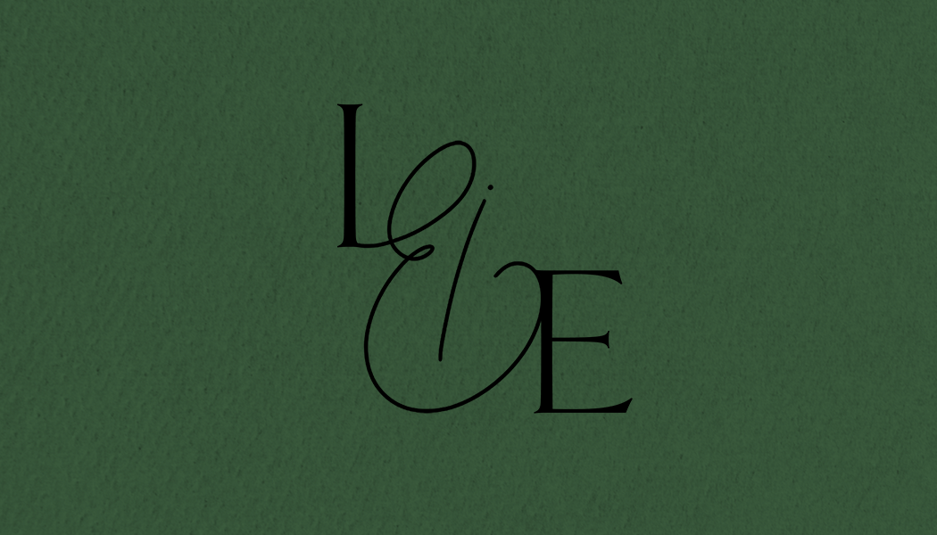
INITIAL – The Initial logo consists of our emblem with the letters I and E either side. This variation is only used in instances where the full logo would be too big, or if it would be illegible on a small size. This logo is interchangeable with the Emblem version.
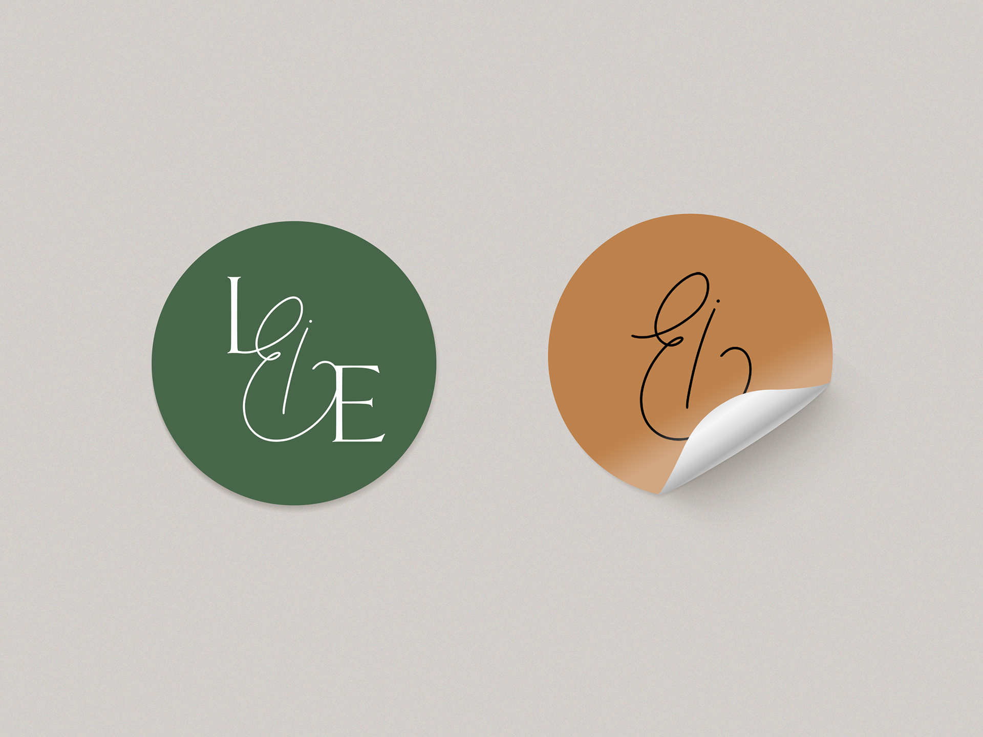
EMBLEM– The emblem logo is like our signature. It is a hand drawn logomark unique to our brand. Our emblem is used on the stickers for our packaging, and in instances such as on social media posts where it acts as a watermark.
✺
"Our logo is defined by a timeless and elegant typeface that is accented by our unique, hand drawn emblem. Our emblem is an ampersand, that connects the words ‘Isle’ and ‘Ember’ together. The ampersand is created by combining the letter I and E to create its unique shape. Our logo typeface is Adobe Goldenbook in full caps with a regular weighting."
COLOUR PALETTE
The designer outlined in the early stages that he has a preference for minimalism and this can be applied to the use of colour for the brand.
While the website will mainly consist of white and grey, colour can be introduced to strengthen the brand identity.
Colours are able to make a brand more recognisable with more immediate impact than words or pictures.
Early moodboards shared with the client identified a preference for colours with neutral connotations, such as greens and earthy tones. These colours also compliment the jewellery being inspired by natural forms.
Once the name Isle & Ember was confirmed, including green and orange as part of the brand colours made logical sense and allowed for earlier colour preferences to be used with a clear purpose.
PRIMARY
ISLE GREEN #4B6749
This luscious green tone is evocative of nature and has a luxurious yet calming feel. You will see Isle Green as part of the website design, social media content, photography and printed materials such as product packaging and business cards. Isle Green is a versatile colour that works well with both silver and gold jewellery collections.
SECONDARY
EMBER ORANGE #BD814C
Ember Orange is used in instances when it is more complimentary than Isle Green. For example, a specific collection of jewellery that is best showcased through burnt, warm tones rather than the cool, green tones of Isle Green. Ember Orange is a good choice for our jewellery collections that use gold and warmer metallics. You will sometimes see Ember Orange as part of our branding materials, such as product packaging, business cards and social media.
LINEN #EDE2D8
Linen is a neutral shade of grey with a peach tone for warmth. You will see Linen as part of our website design and on social media. As a very light colour, Linen can be applied easily as a background shade or for overlaying photography. Linen is a good colour choice for jewellery collections that use silver and coloured gemstones.
ACCENT
CULTURED GREY #F4F2F0
Our accent colour is Cultured Grey. This light grey tone with a slight warmth can be found as a background colour on our website and is used in instances where white is too harsh.
FONT
DAVYS GREY #585858
Our font colour is Davys Grey. Due to its stark contrast, we avoid using black where possible, and this is apparent in our font. Instead, we opt for this dark grey font colour to soften our typography.
TYPOGRAPHY
Typography is an important part of the visual vocabulary of a brand. It is a reflection of the words being spoken, and compliments the brand overall. In practical terms, the typography must also serve a functional purpose and it must be legible and accessible. Poor typographic choices could detract from the overall aesthetic of branding.
I started my typographic research by looking at fonts that are popular choices for digital viewing, as the brand will ultimately be an online based business. I also wanted to use free fonts that would be easily accessed and applied to platforms without the need for special licensing.
Based on this research, Sans Serif fonts are a particularly effective choice for digital platforms as they offer good readability across screen sizes, and 'the mood and feelings most associated with sans serif typefaces are modern, friendly, direct, clean and minimal' (Design Shack) which is entirely in-keeping with my brand aims.
✺
I selected Helvetica Neue to be the main font in instances such as body text. As a rework of Helvetica, Helvetica Neue benefits from wider characters and softer, more rounded edges than Helvetica. This makes the typeface a contemporary, familiar font that is versatile and complimentary to more elaborate fonts that can be partnered with.
IvyMode is a free font from Adobe. The font is described as being 'designed for fashion magazines and luxury brands' (The Ivy Foundry). IvyMode is a good choice for creating more statement text and to be used decoratively, for example as headings on the website or in the creation of graphics.
These two fonts offer the scope to be used successfully across the brand without the need to introduce other fonts that will dilute the overall look and feel of the brand. By changing the weighting of the fonts to a core selection of permitted weightings (primarily light, medium/semibold and italic versions), Isle & Ember's typography can stay consistent, while being suitable for various outputs.
PHOTOGRAPHY
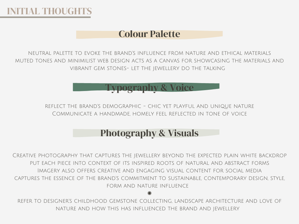
As the jewellery designer is in the early stages of his jewellery making, existing photos of the pieces weren't available. I also felt it would be a good opportunity to use the photography as a way of strengthening the brand identity as it allowed me to incorporate the brand guidelines into the imagery.
Photography is a highly important asset, particularly in building a brand with e-commerce requirements.
This primary imagery would strengthen the overall brand guidelines and give clarity and an accurate representation of how the jewellery brand could be promoted when it launches.
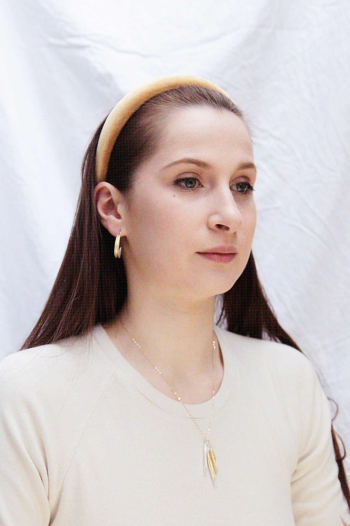
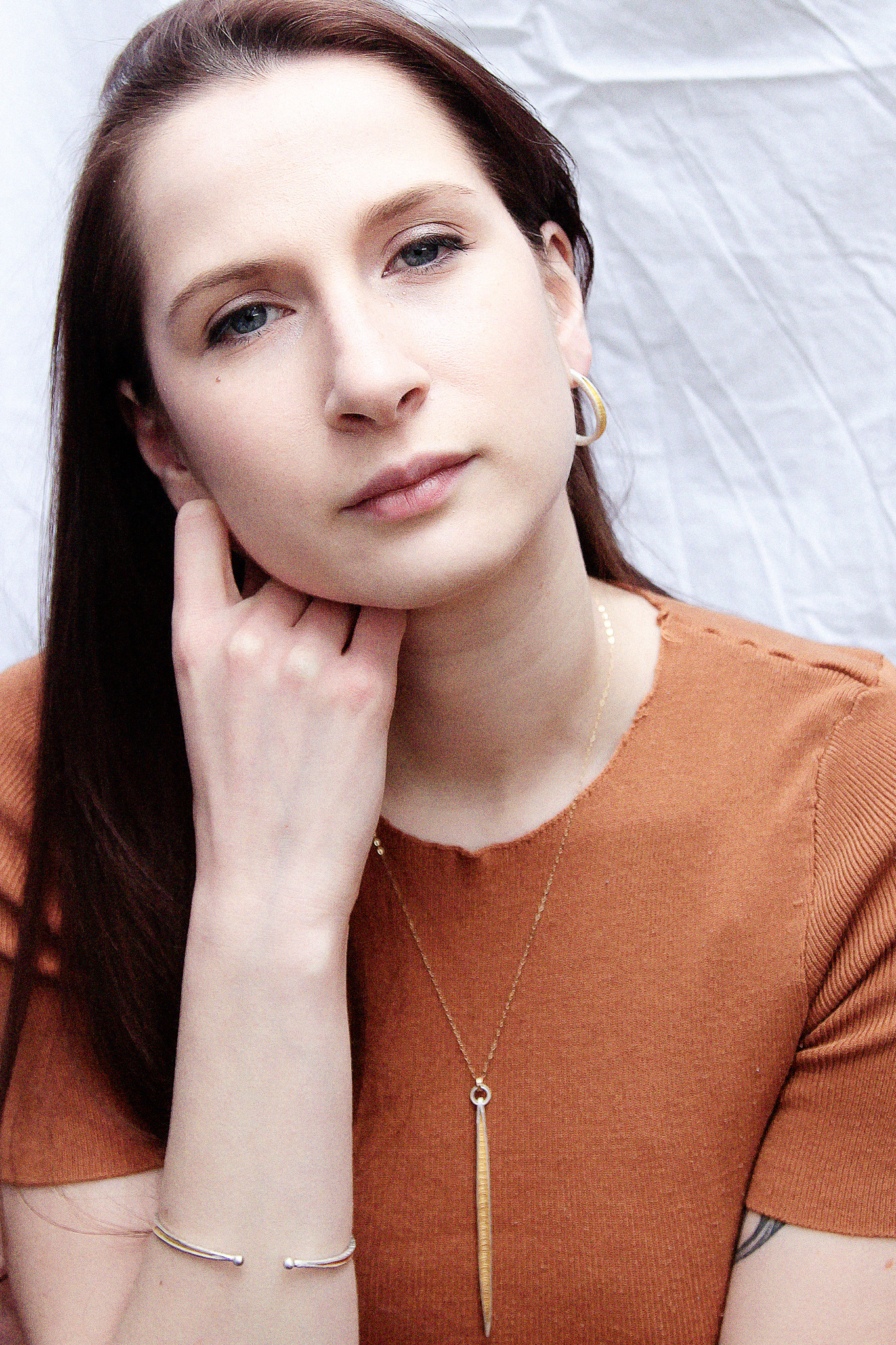
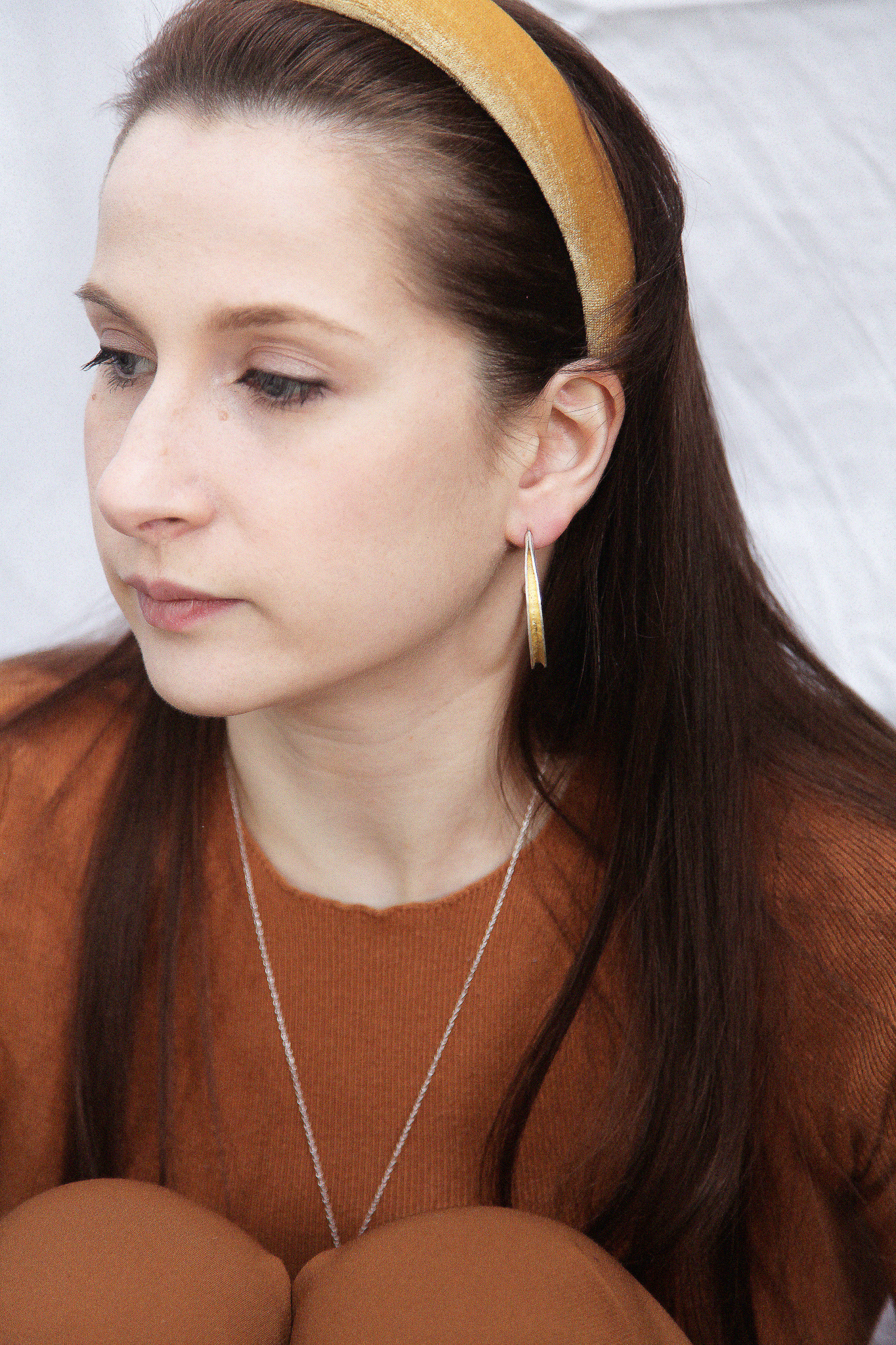
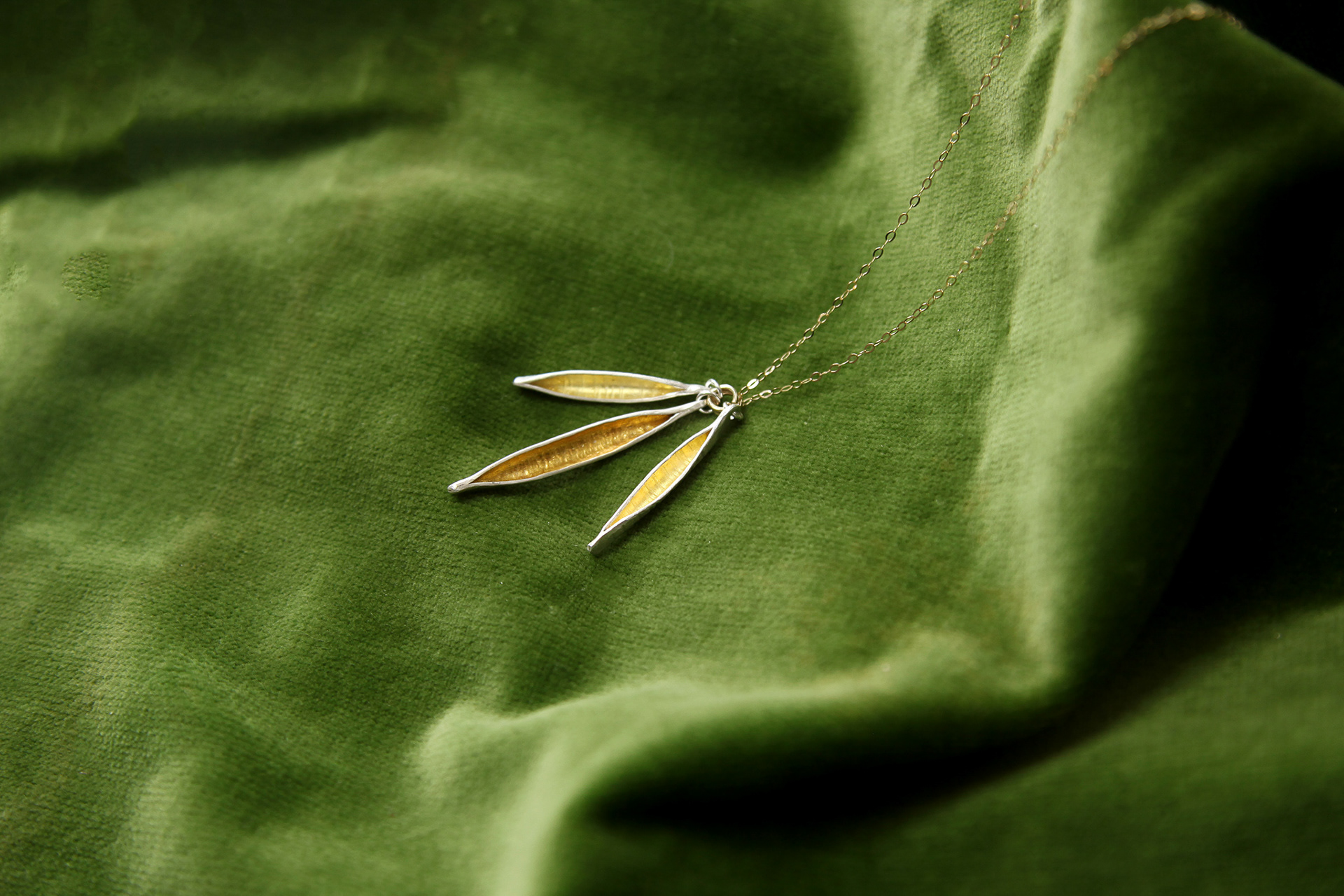
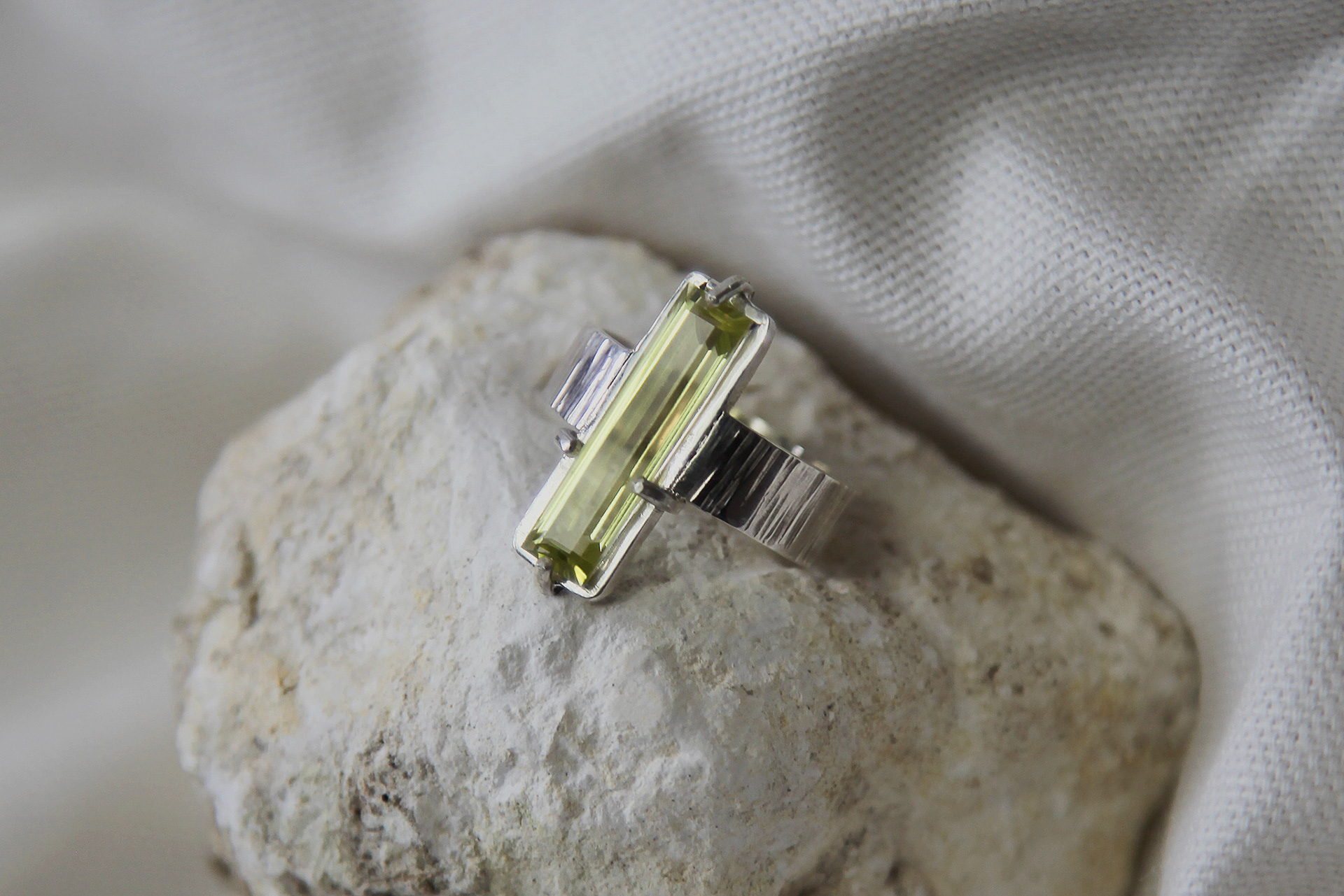
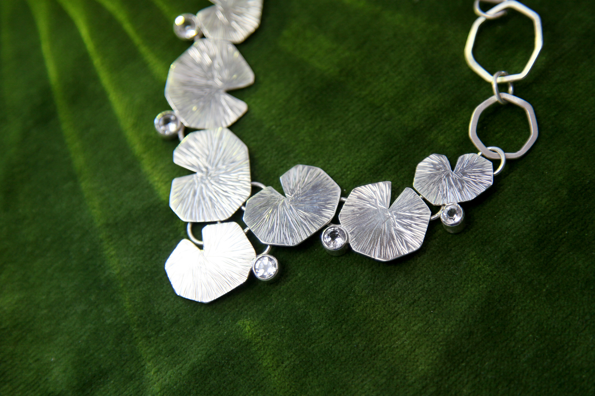
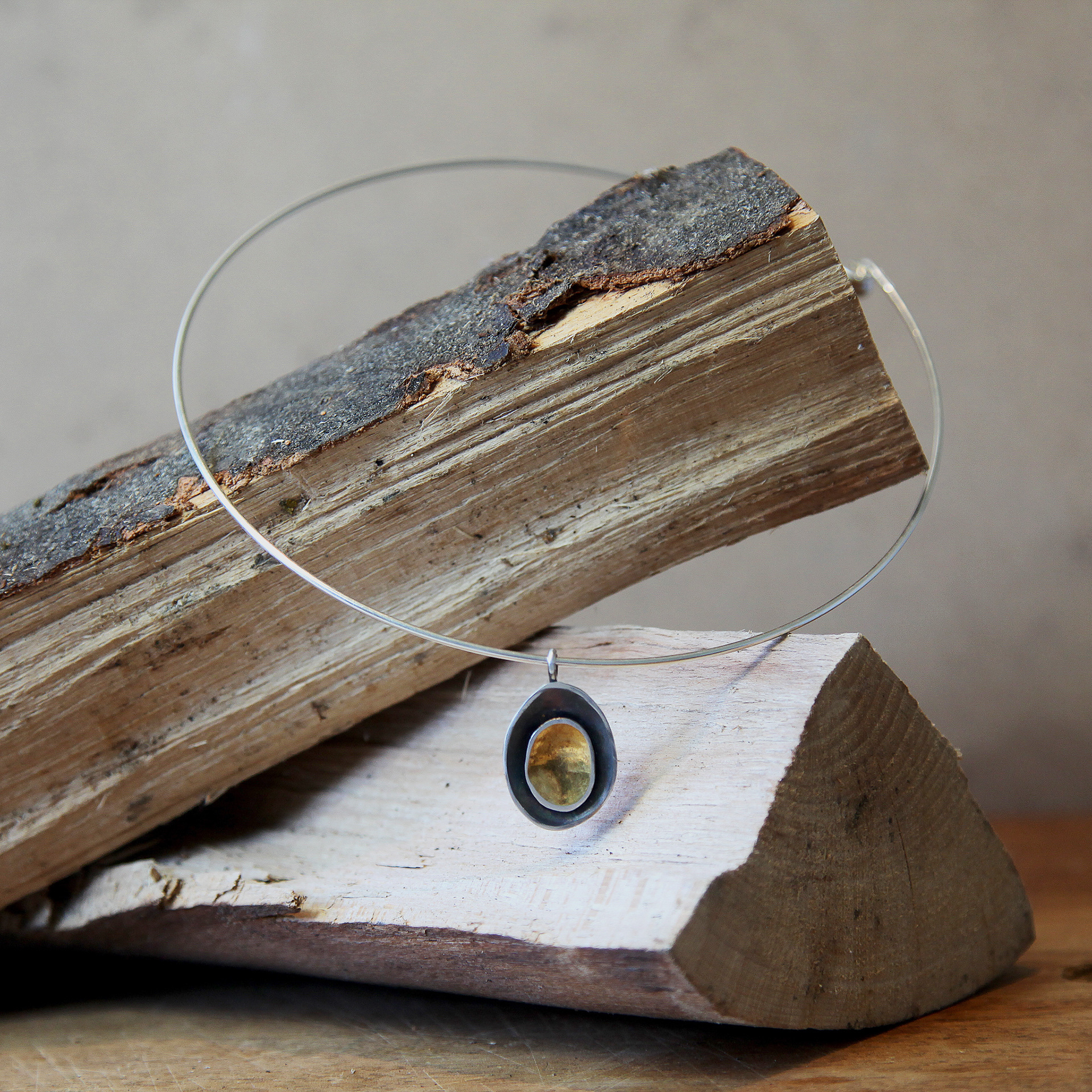
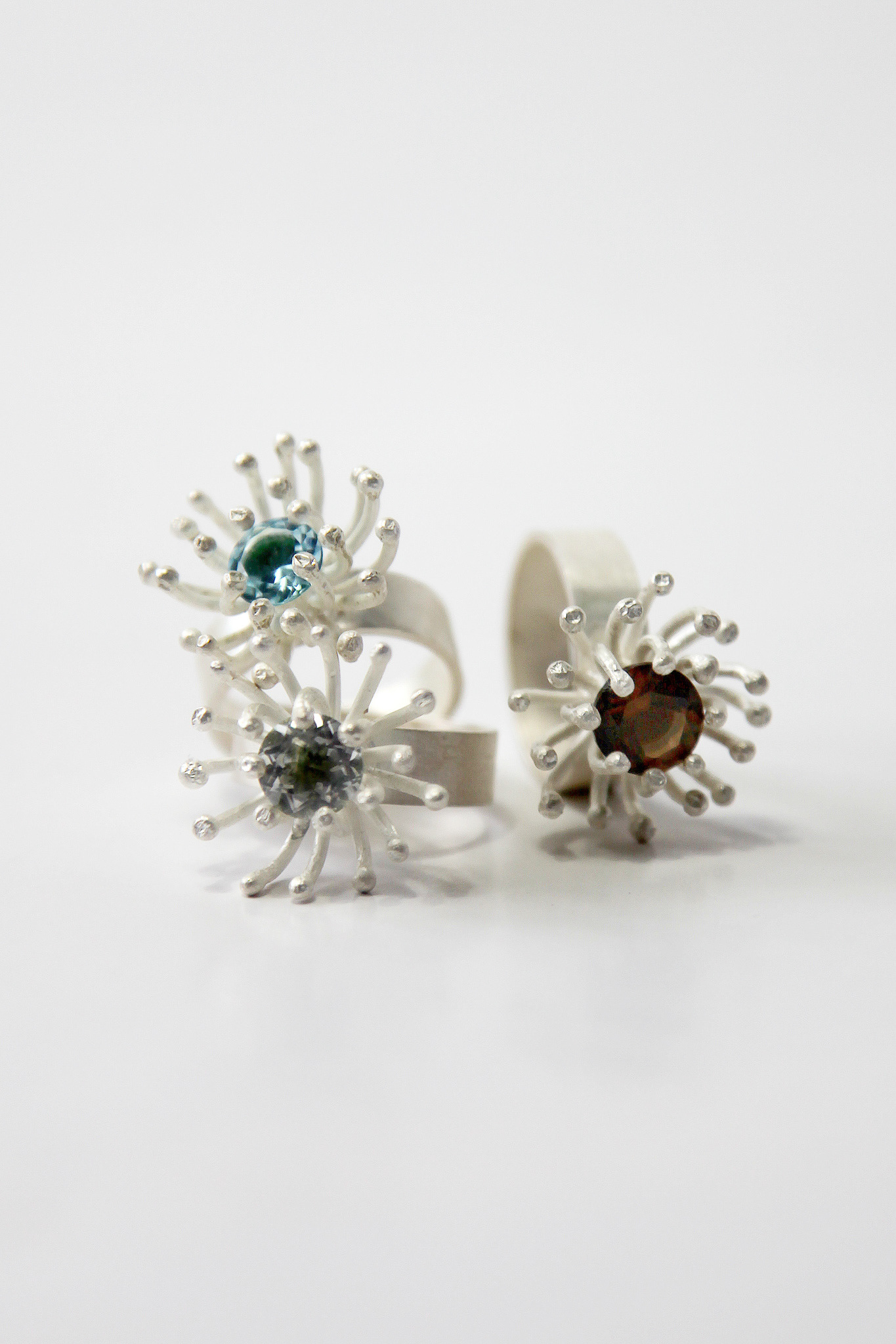
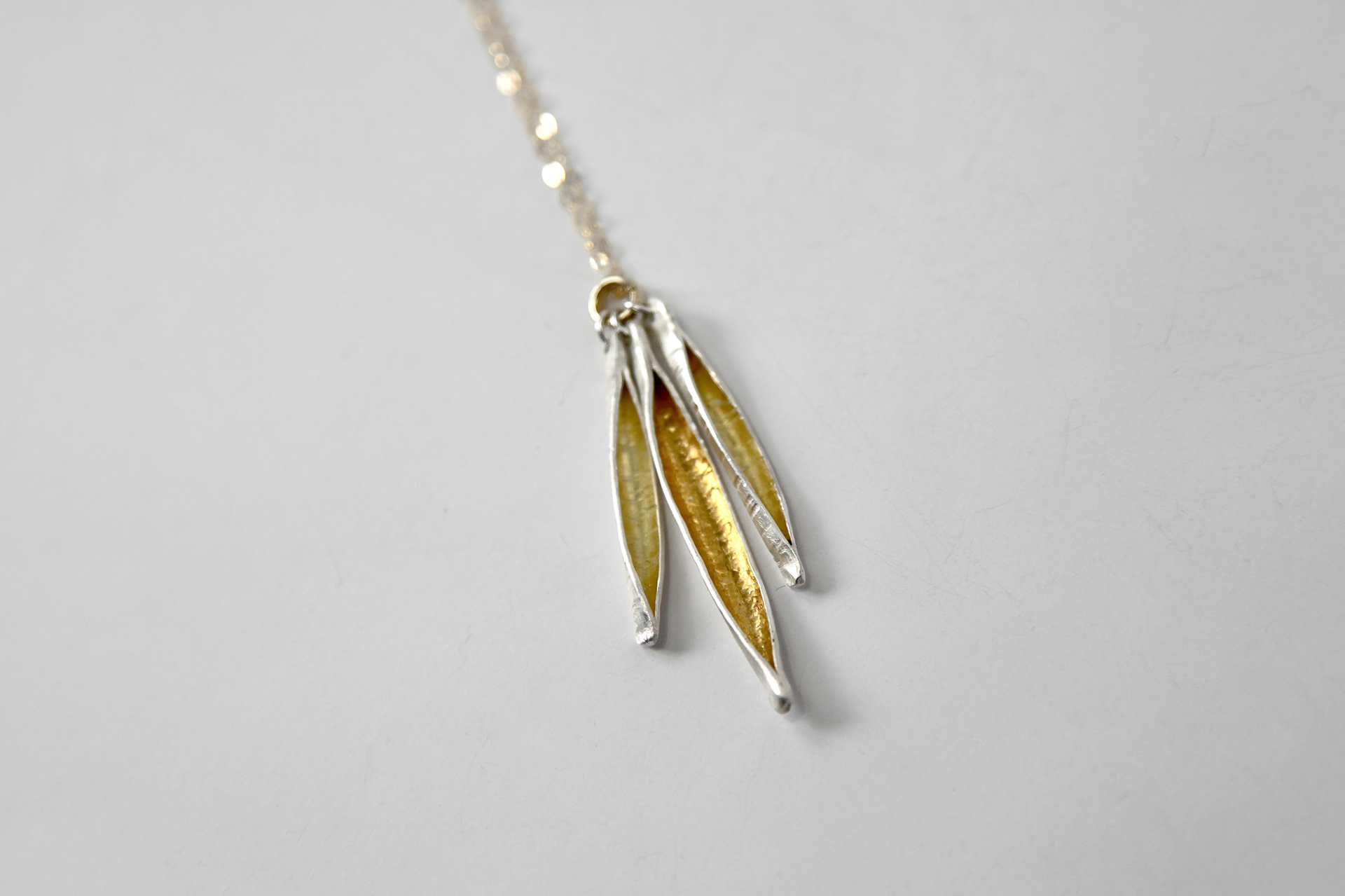
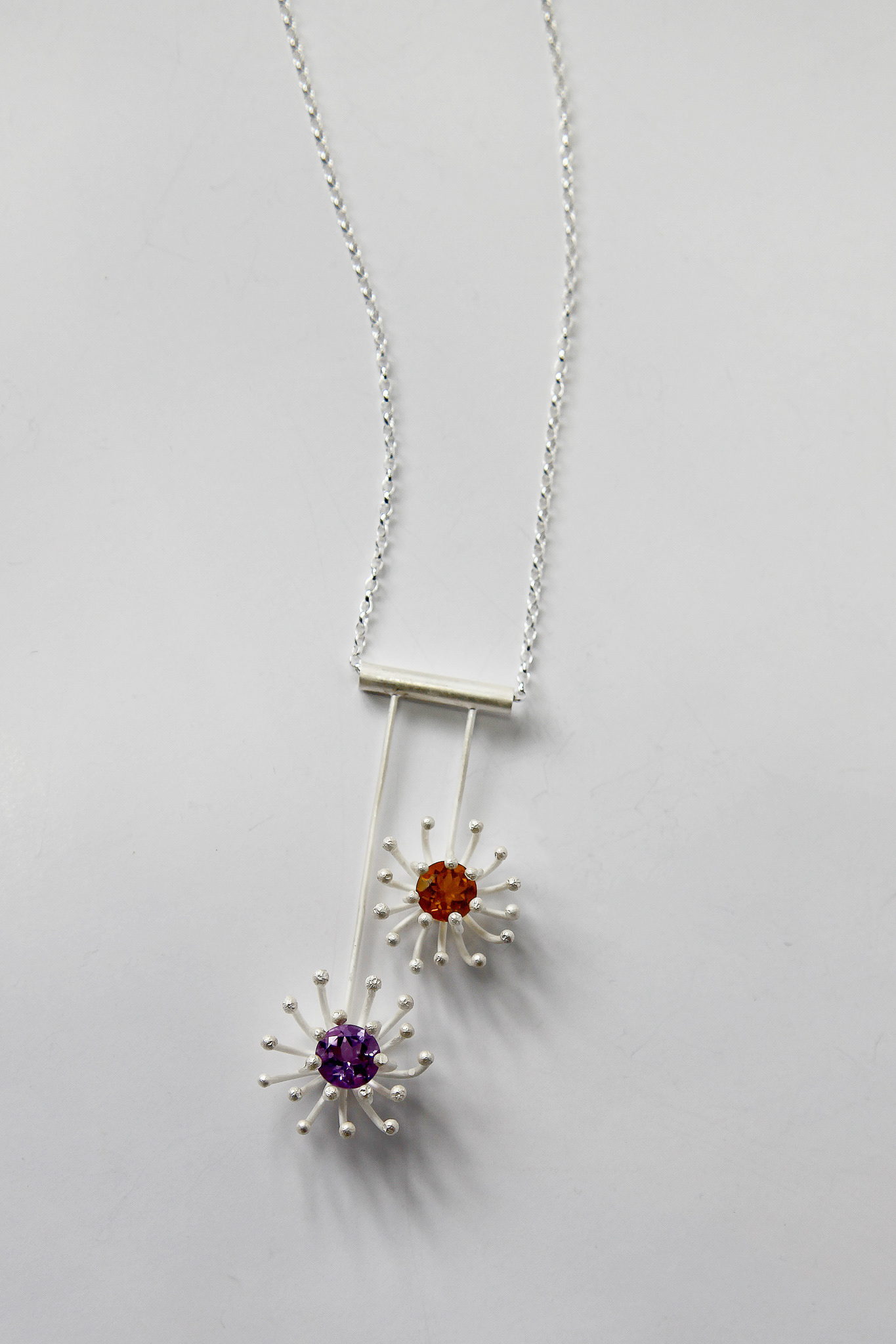
Three styles of photography were undertaken using the jewellery, including photographing with a model, styled photography and product photography. The idea is that all of these forms of photography would work alongside each other, while offering some dynamic imagery that can serve multiple purposes, including website, promotion and social media.
✺
"Photography is a vital part of Isle & Ember’s visual language. Our photographs allow us to not only showcase Isle & Ember’s jewellery and capture the details of each piece, but also to tell a story. By considering every aspect of our brand photography, from lighting and styling to post-production, Isle & Ember can maintain a consistent look and feel across our brand that communicates our message of quality, sophisticated jewellery that celebrates the beauty of the natural world.
At Isle & Ember, we use a combination of photographic set ups to showcase our jewellery. Where possible, each item of jewellery must be photographed in 3 ways:
Product Shot –
E-commerce photograph using a plain white or grey background. Jewellery is photographed at different angles and details are captured. These images are essential for our website and documenting our collection.
Model Product Shot –
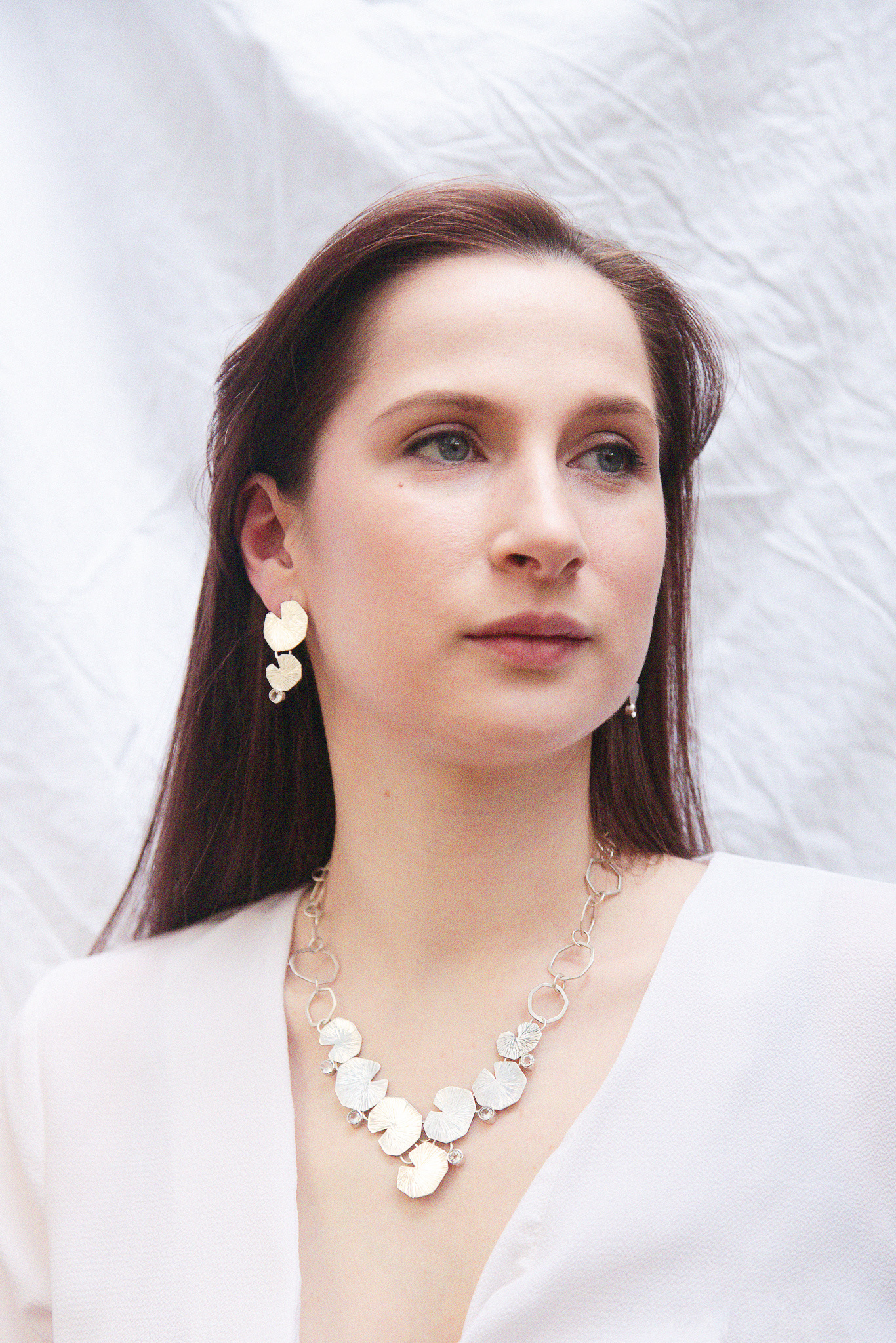
Editorial style photograph showing the jewellery being worn by a model. This shows our jewellery at its best, being worn! Our audience can then see how the jewellery looks on, and gives a greater understanding of the scale of a piece and ways our jewellery can be styled. This imagery is great for both our website and our social media.
Styled Product Shot – Editorial style photograph using props and creative styling. Our jewellery is photographed in a creative and dynamic way to engage our audience. These images are great for social media and for making a statement on our website. These images do not require a model- they’re more like still life!"
UNEDITED CONTACT SHEETS
EDITTED IMAGES
PHOTOSHOOT 1 - MODEL
Photographing with a model enables the audience to get an accurate picture of the jewellery and is an essential part of e-commerce imagery.
Photographing with models lets the consumer see how the product looks when worn, the scale of the item and even how to style it.
I used a model that fits into the target age demographic in order to make the imagery appealing and relatable amongst the target audience.
I also incorporated the brand colour of burnt orange in the model's styling to create unity with the rest of the branding and have a subtle nod to the brand colours.
Unfortunately, due to time constraints and poor weather conditions, the photoshoot was quite short, so I was unable to photograph every piece of jewellery on the model, or be as experimental with multiple angles, poses and styling.
In post-production, images were edited with Lightroom and Photoshop. Minimal editing took place in order to maintain a truthful image, however images were brightened due to low light conditions.
By exposing the images more in post production, the light, crisp imagery demanded for the brand was able to be created. This brightness and use of white is complimentary to the overall feel of the brand, maintains an elegant quality and is in keeping with the designer's minimalist preferences.
PHOTOSHOOT 2 - STYLED PRODUCT
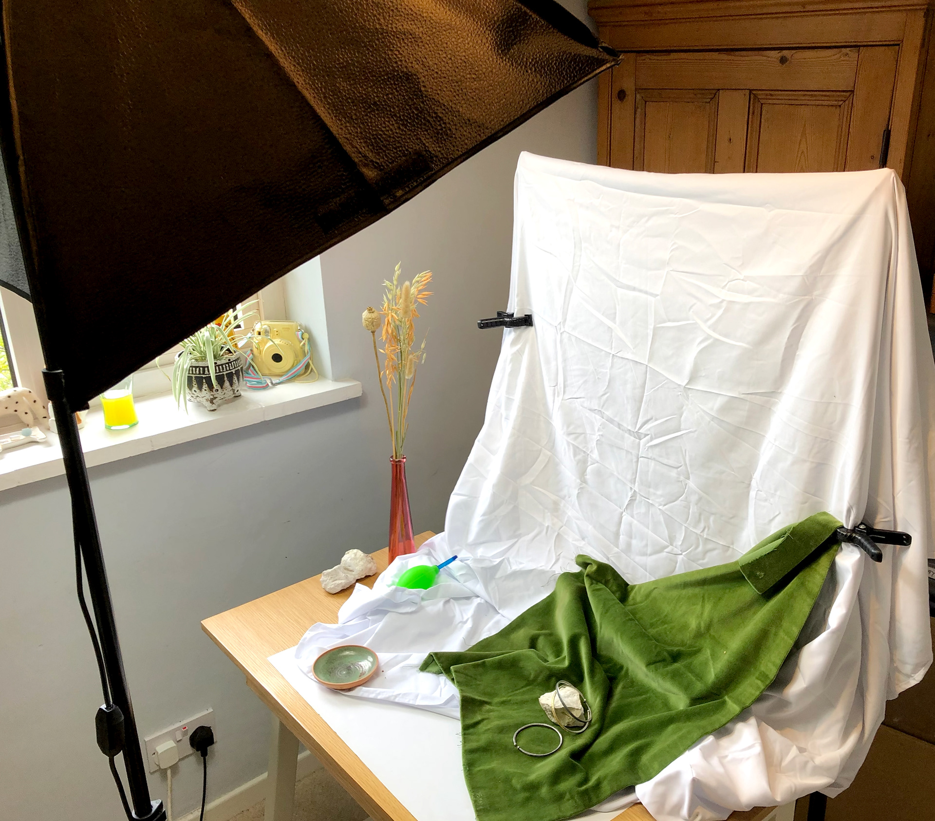
The second photoshoot I completed with the jewellery was taking a more still-life / styled approach. Modern consumers are no longer satisfied with plain and uninteresting imagery, thanks to our visual culture and the likes of Instagram. Brands now need to be able to present their products in more dynamic ways, with interesting photography that is aesthetically pleasing. This form of imagery will be effective in grabbing attention of website visitors and creating content that is more engaging for social media.
I styled this shoot using a combination of natural materials, primarily chalk stones and wood. These natural materials were contrasted with velvet, to add a more luxurious feel to the imagery and enhance the jewellery textures and finer details. These photos also enabled me to integrate the brand colours with the use of green and the warmth of wooden tones.
PHOTOSHOOT 3 - E-COMMERCE PRODUCT
The final photoshoot is the most conventional, but the most essential from an e-commerce sense.
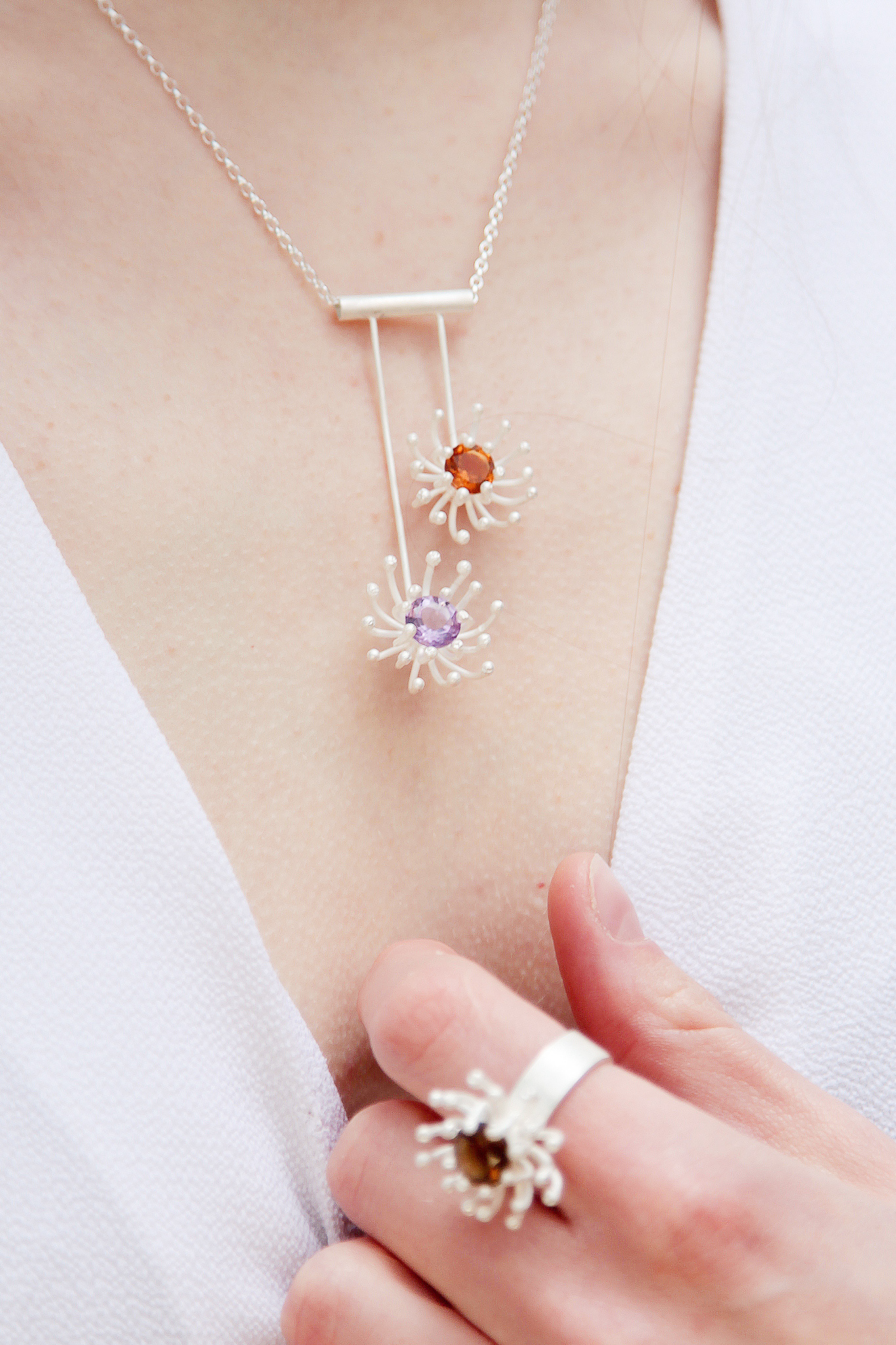
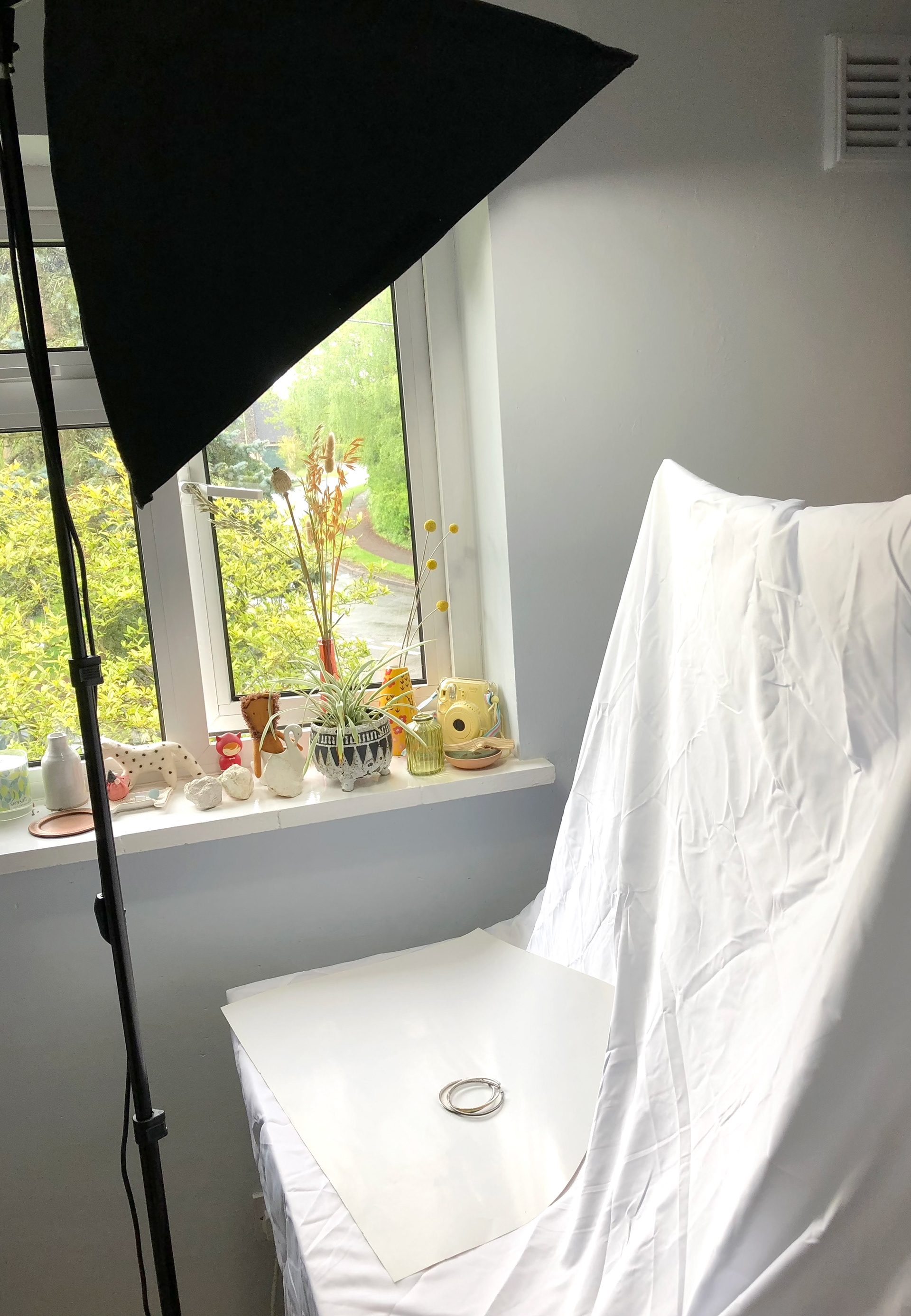
I photographed each item of jewellery against a white background in order to create some simple product imagery. The purpose of these images was to show the jewellery honestly and without any other distractions. Each piece of jewellery was photographed from different angles as would be required in reality. Finer details such as textures, gemstones and fastenings were also captured.
These images were taken without the preferred bright natural light to create a white background, however in the end I decided that a light grey provided a more subtle set of images that worked better alongside the other photography (and the grey in the brand colours) than a stark white background would have done.
DESIGN PROCESS | BRAND GUIDE
The first part of the final outcomes for this branding project comes in the form of a brand guide. This brand guide would be an important tool in providing all those involved with the brand to understand the back story, what inspires the brand and how to execute design features to maintain a clear and consistent brand identity.
I drafted each page in Canva as it allowed for a quick and easy way of considering layout and what to include in the guidelines. Having established this mockup, I then created the final brand guide using InDesign to make the guide as professional looking as possible.
When creating the brand guide, I made sure that I incorporated the correct brand colours, typography and tone of voice so that it would be a true reflection of the guidelines being set out.
Each page of the brand guide can be viewed on the final outcomes page, along with an interactive copy that was uploaded to Issuu.
DESIGN PROCESS | WEBSITE
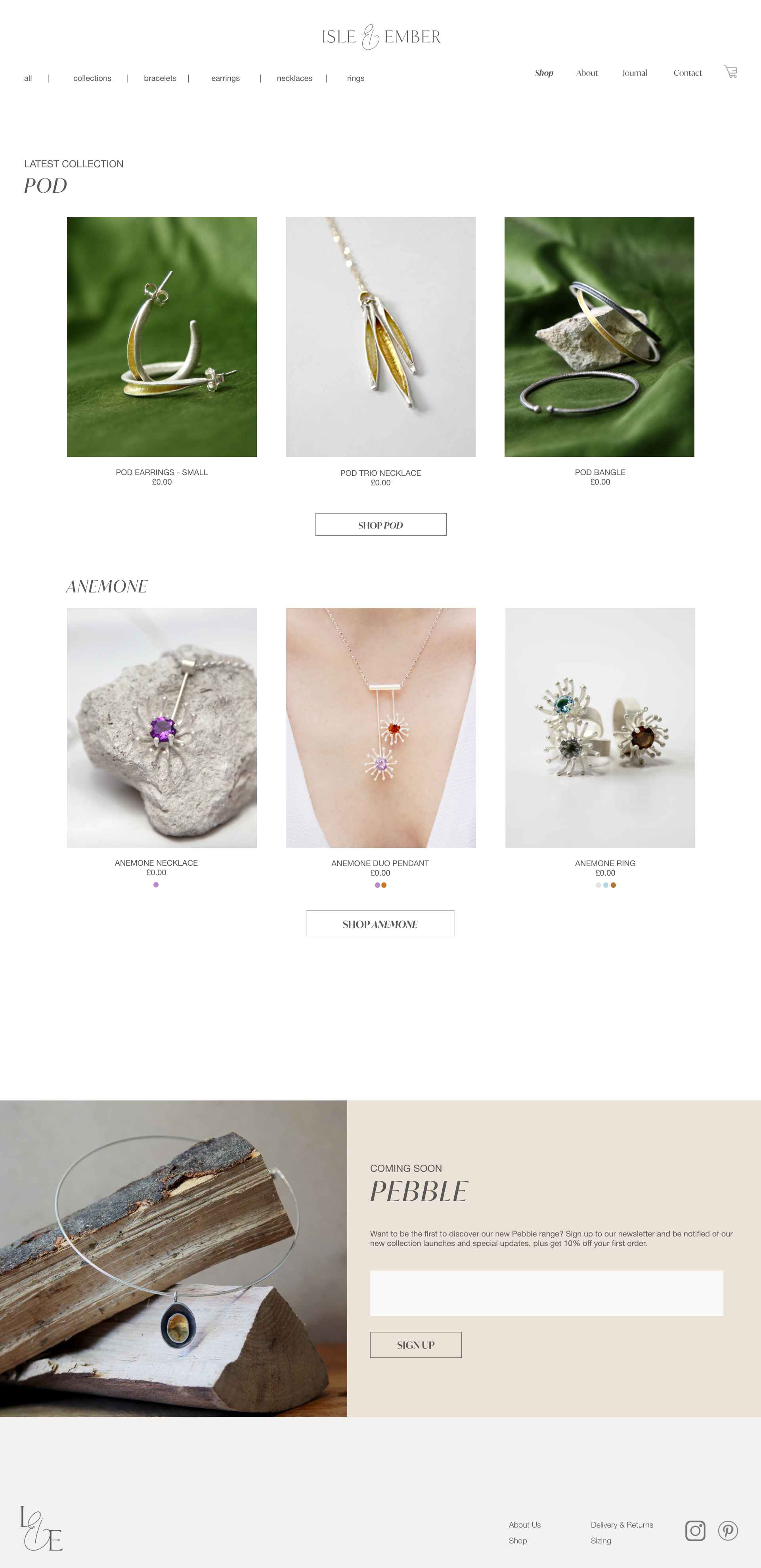
The second part of the final outcomes for this branding project comes in the form of a website prototype.
As the designer is not in a position to launch the business yet, and to meet the requirements of this project, only a prototype is required. I created the website using Adobe XD as it allows for prototypes to be interactive and they can be shared.
✺
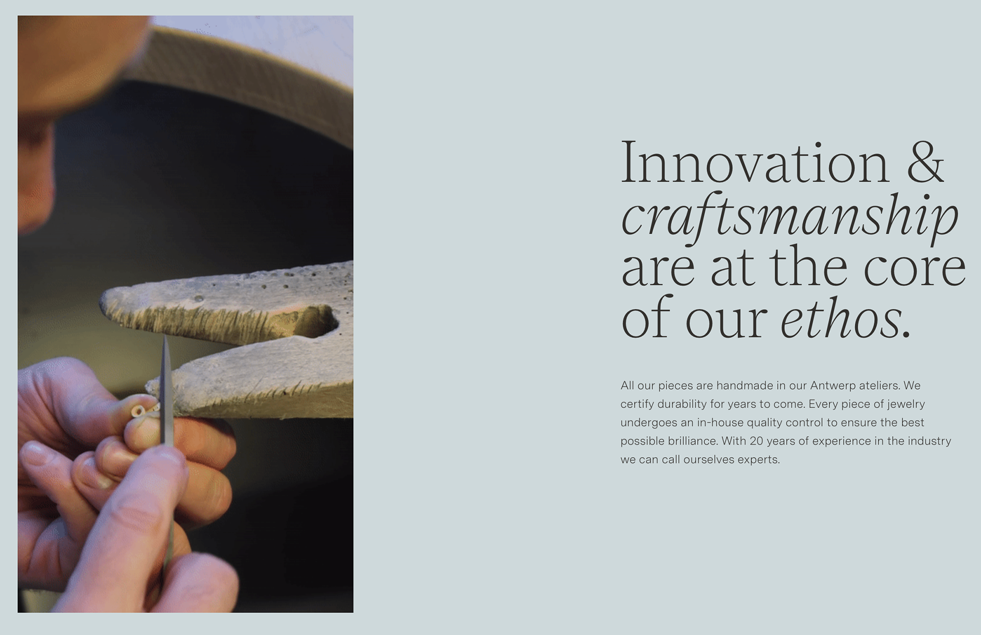
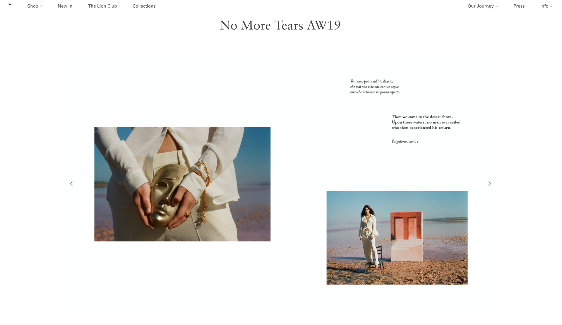
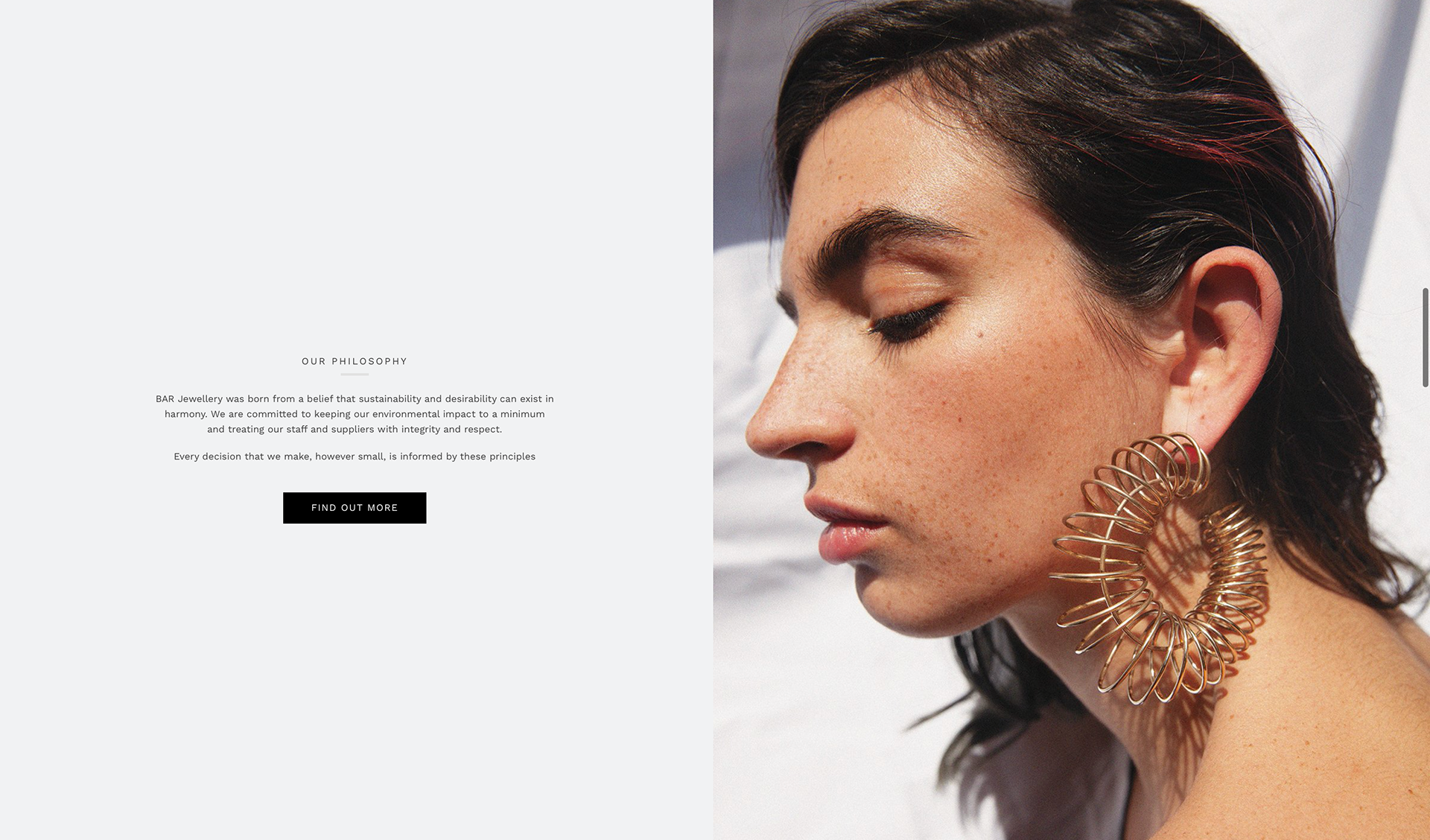
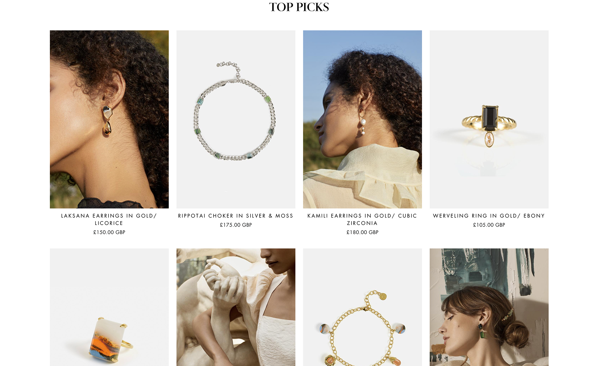
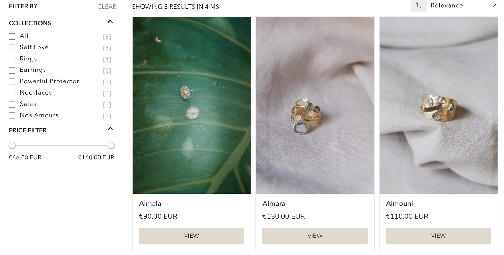
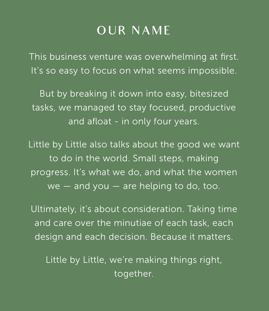
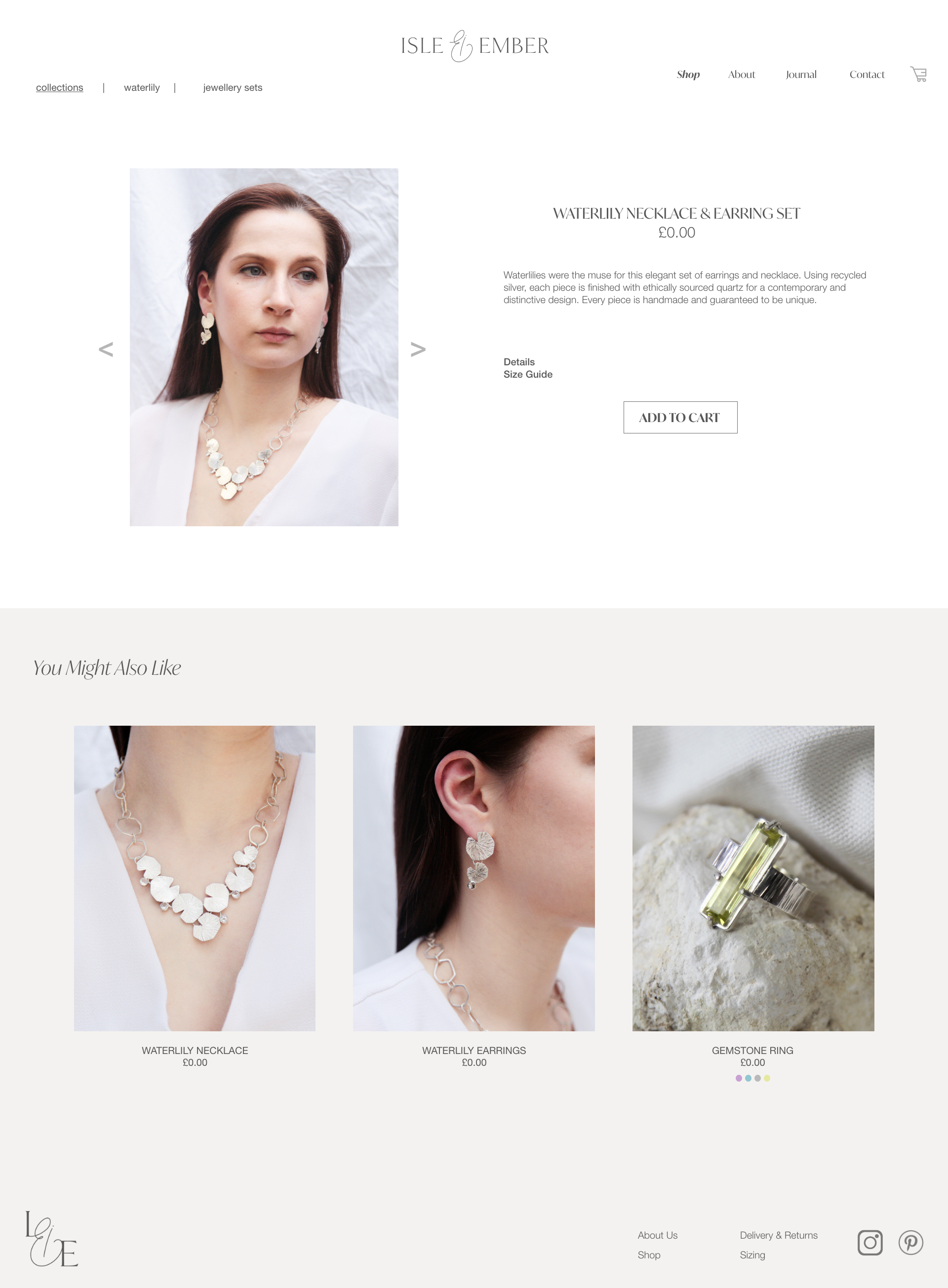
The intention for the website prototype is to provide an overall look and feel for the brand, and puts into context all the elements of the brand guidelines, including the use of colour, imagery, tone of voice and logo placement. Everything comes together in the website, offering an opportunity to showcase all elements of the brand identity in one place, and in an environment that replicates what the audience will see.
It was important to showcase the brand in this format as ultimately the brand aims to be an online business, therefore having a website with e-commerce features and building a strong online aesthetic was crucial.
INSPIRATION & INFLUENCES
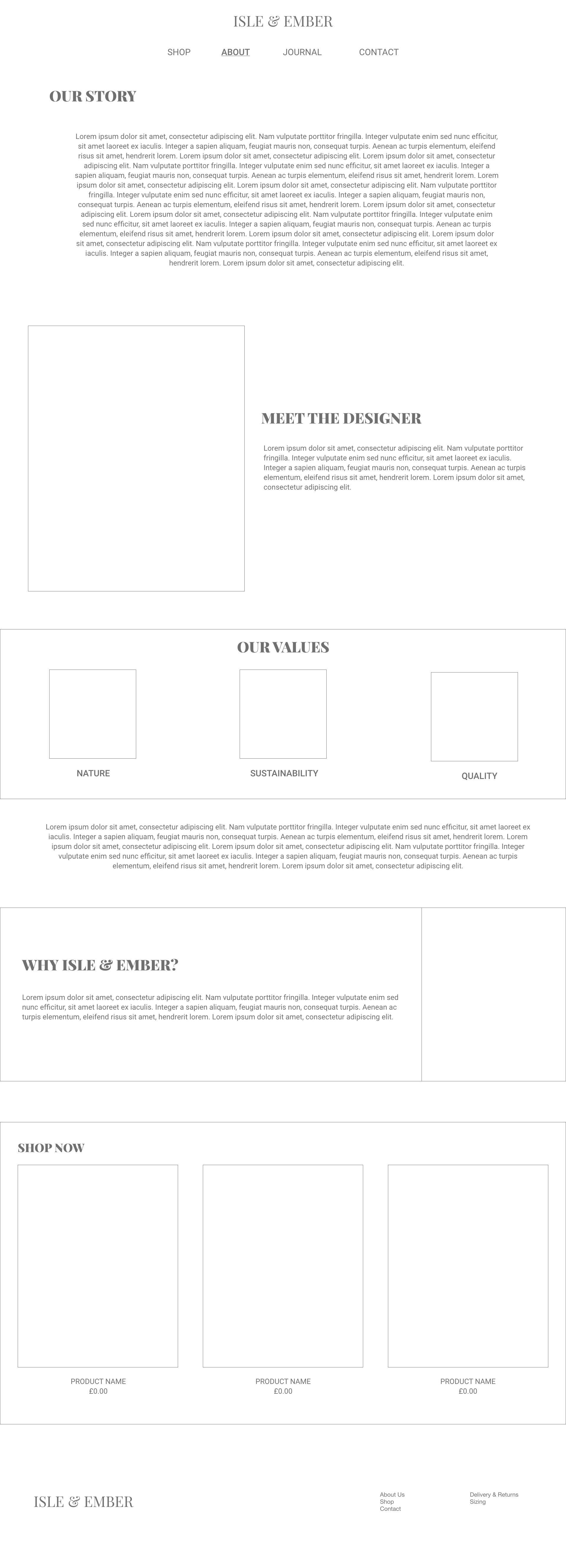
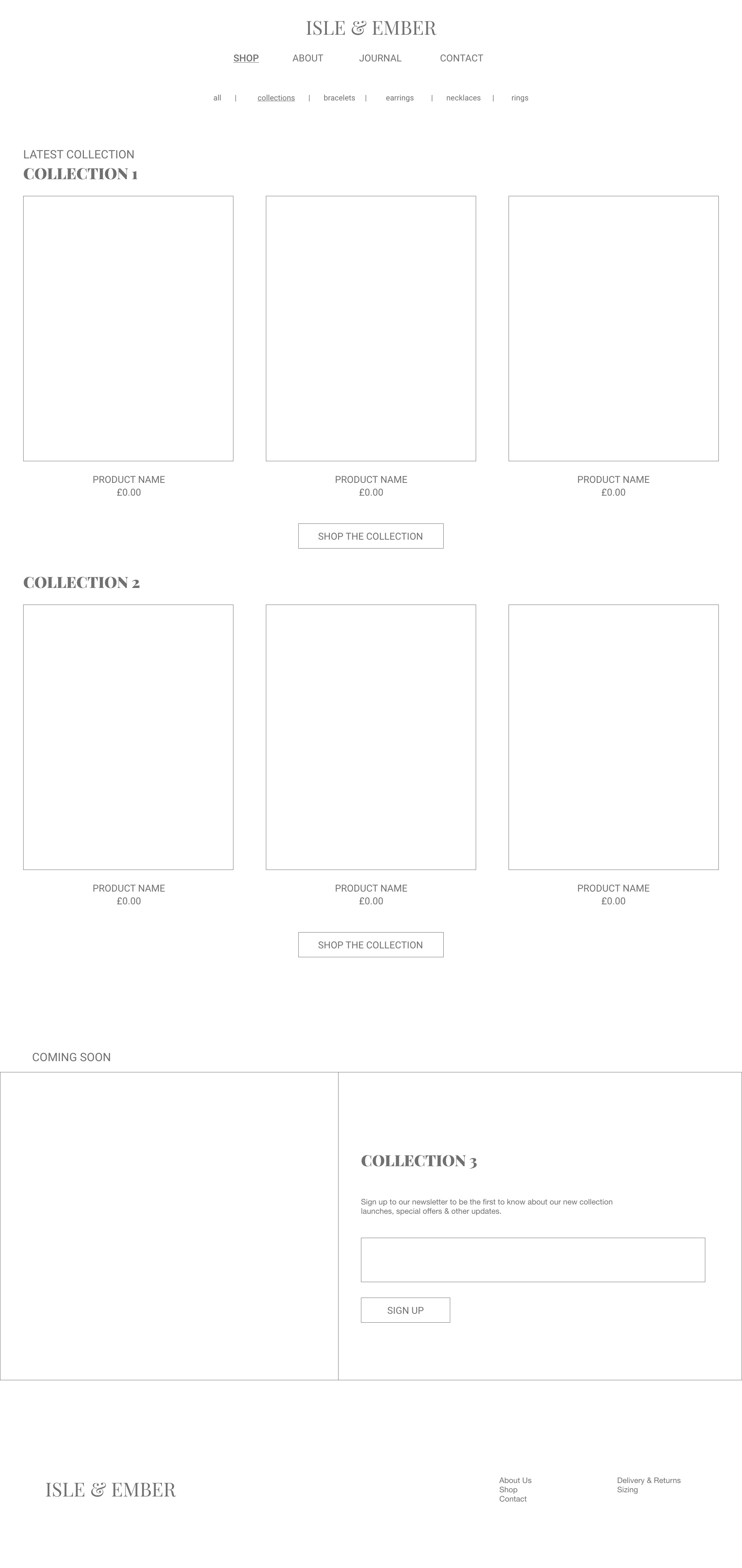
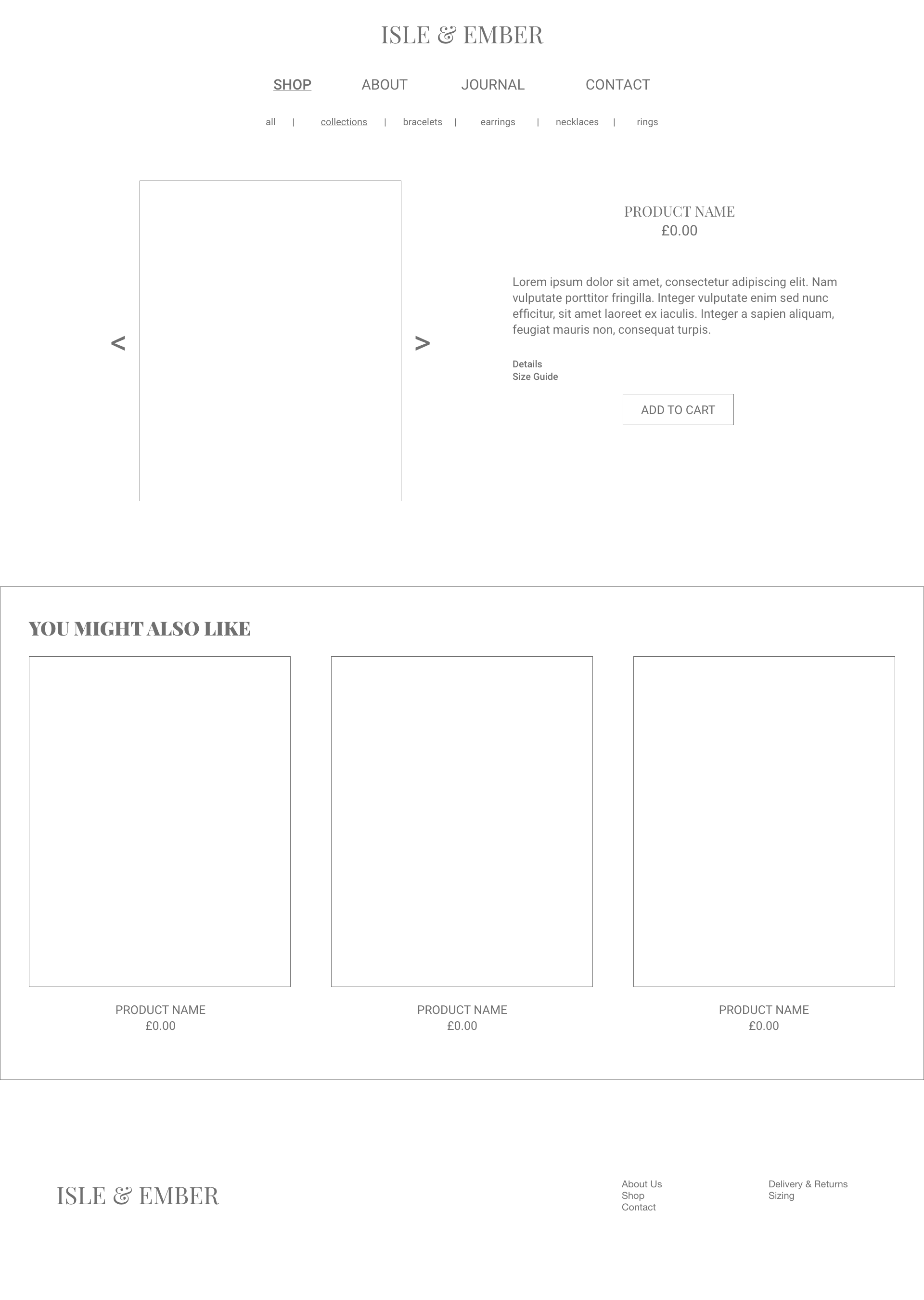
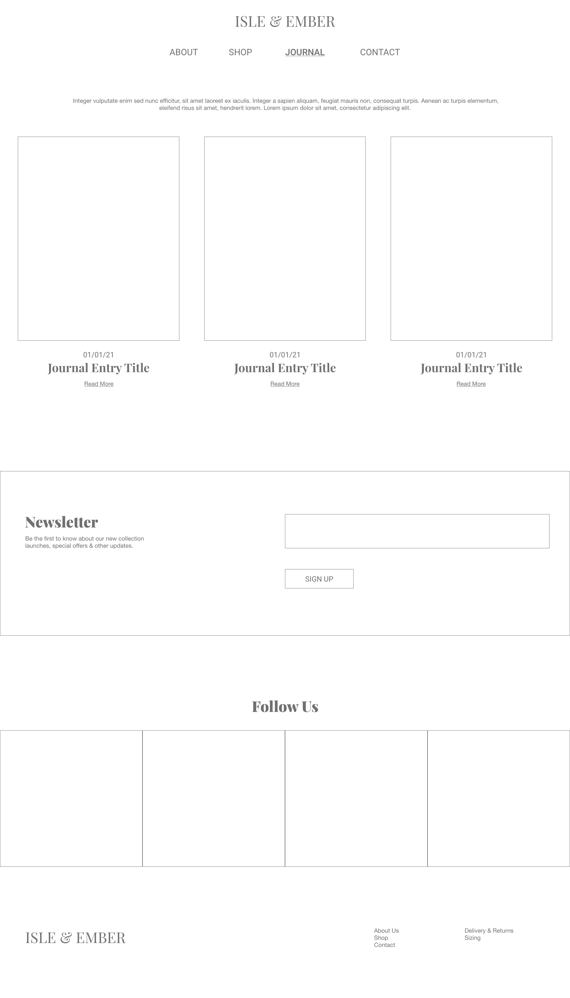
WIREFRAMES
Having researched into many of the website platforms I decided that Squarespace would be the best option for the brand at this time, as it offers sleek and professional website templates as well as the ability to integrate shopping features. This makes the platform a good option for small independent artists, rather than Shopify which is more expensive and better suited to brands with a higher volume of sales and need to streamline their e-commerce performance.
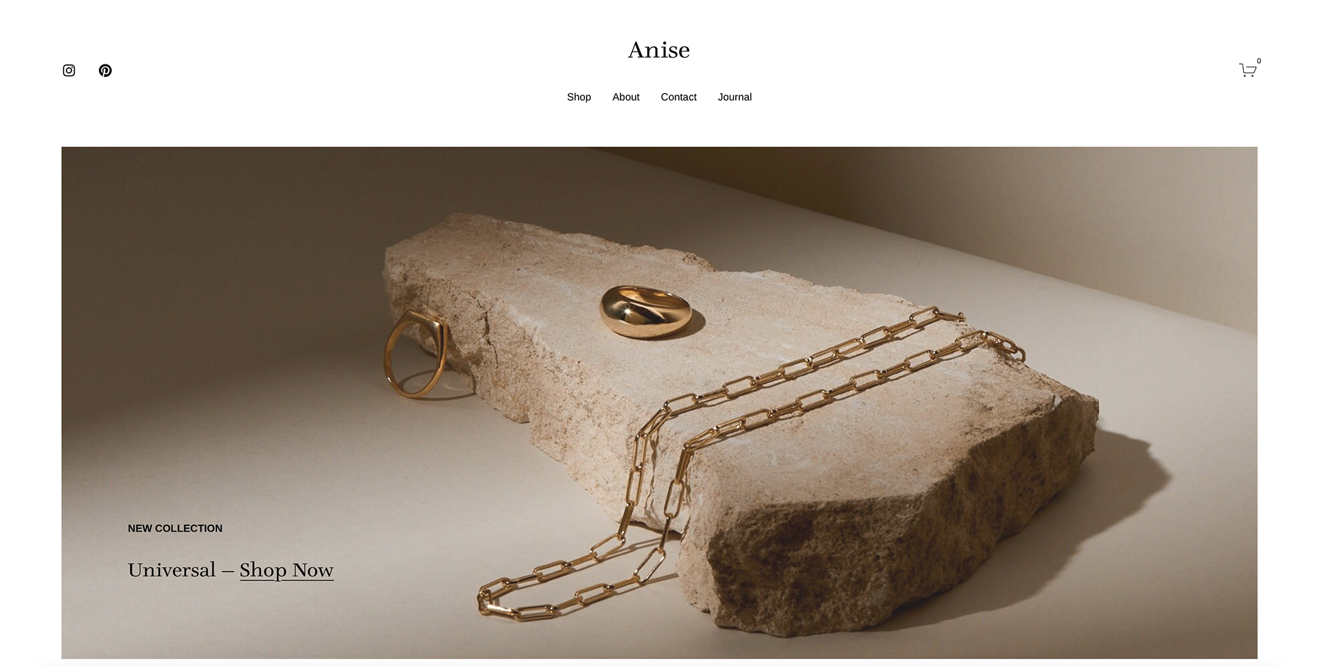
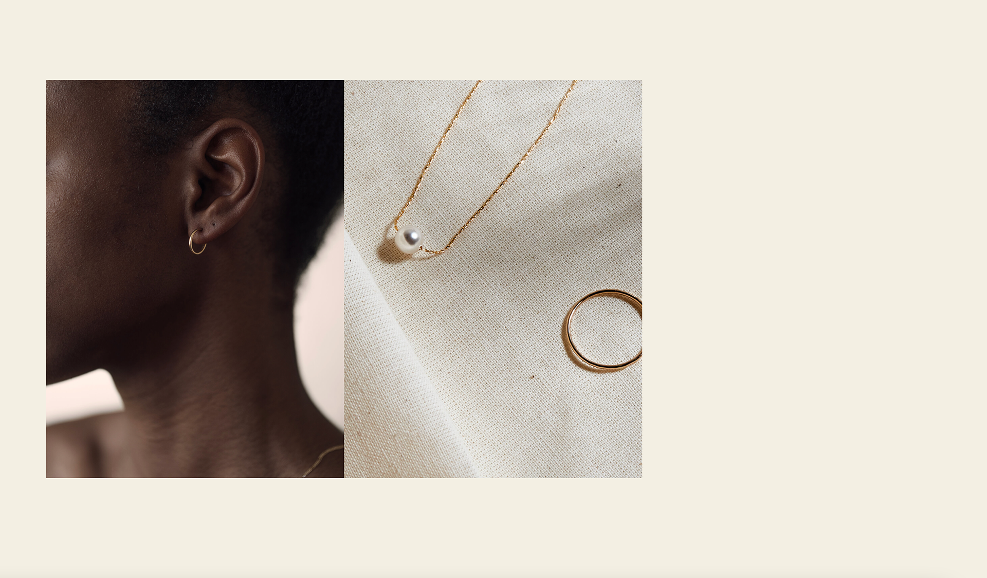
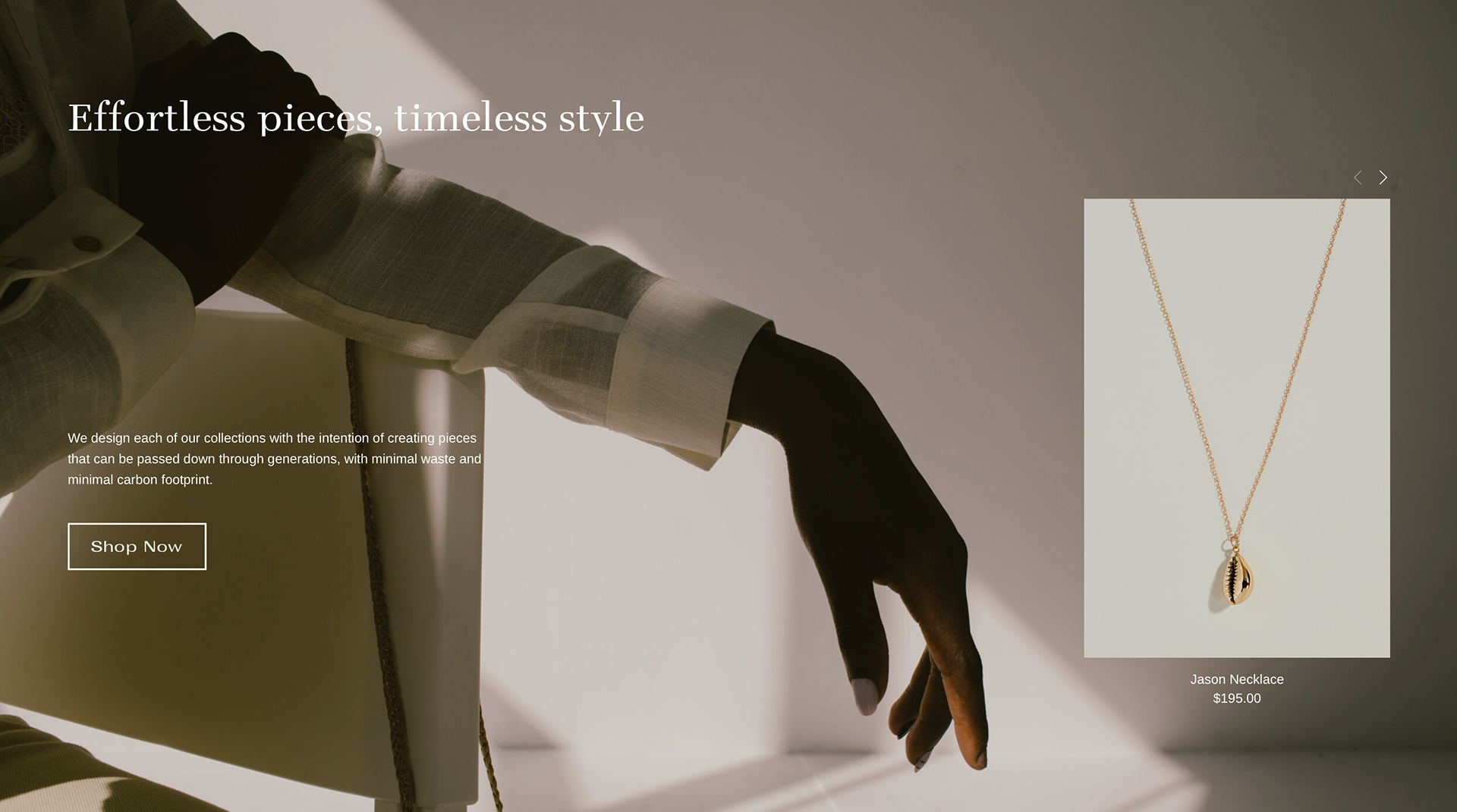
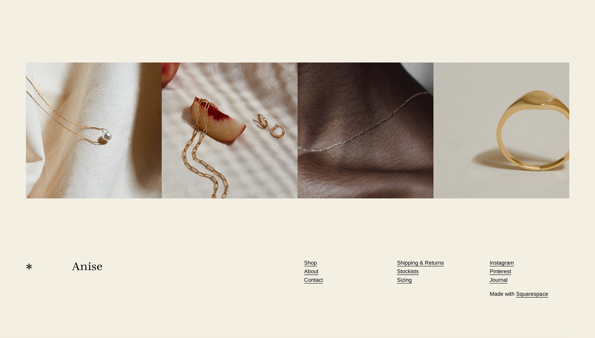
As the designer is not ready to launch a website yet, it was not cost-effective to set up a website that would need to be paid for. Instead, I referred to the existing website templates available through Squarespace and identified the Anise template as a good template to model the prototype on as it has a very clean and elegant feel and is well suited to jewellery and e-commerce.
I based my wireframes off a combination of influences research and this template, so that in the future this prototype could easily be transferred to the Squarespace platform with minimum adjustments. Wireframes were created in Adobe XD to allow for a seamless development of high-fidelity wireframes and the final prototype.
PROTOTYPING PROCESS
(ADOBE XD)
FINAL ARTBOARDS
DESIGN PROCESS | COLLATERAL
The third and final part of the final outcomes for this project comes in the form of Collateral.
As a brand presents itself across mediums, demonstrating the brand identity in the form of printed materials, ephemera and product packaging helps to contextualise the branding assets.
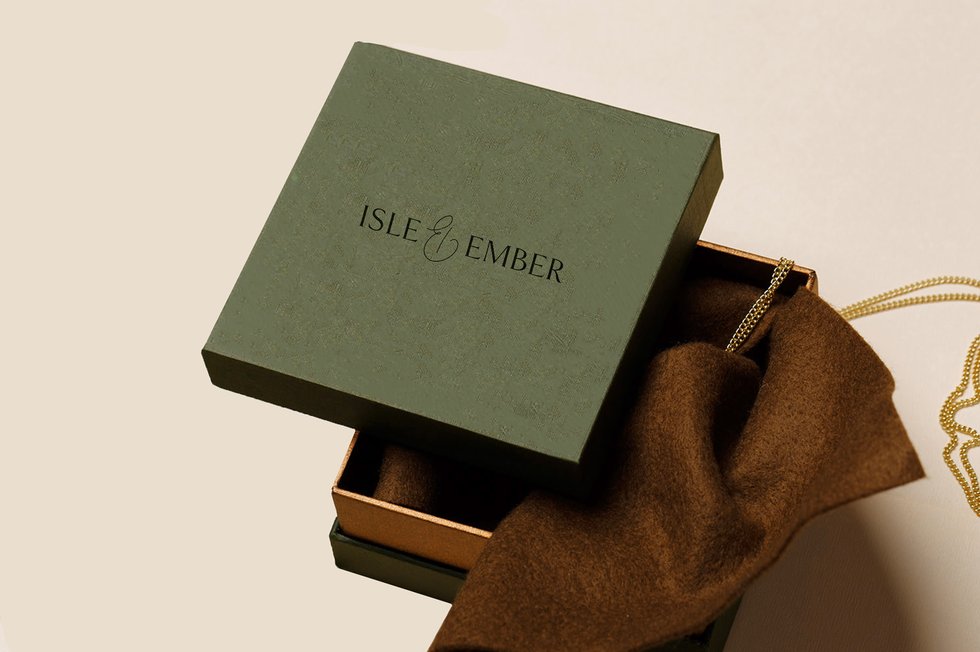
PRODUCT PACKAGING
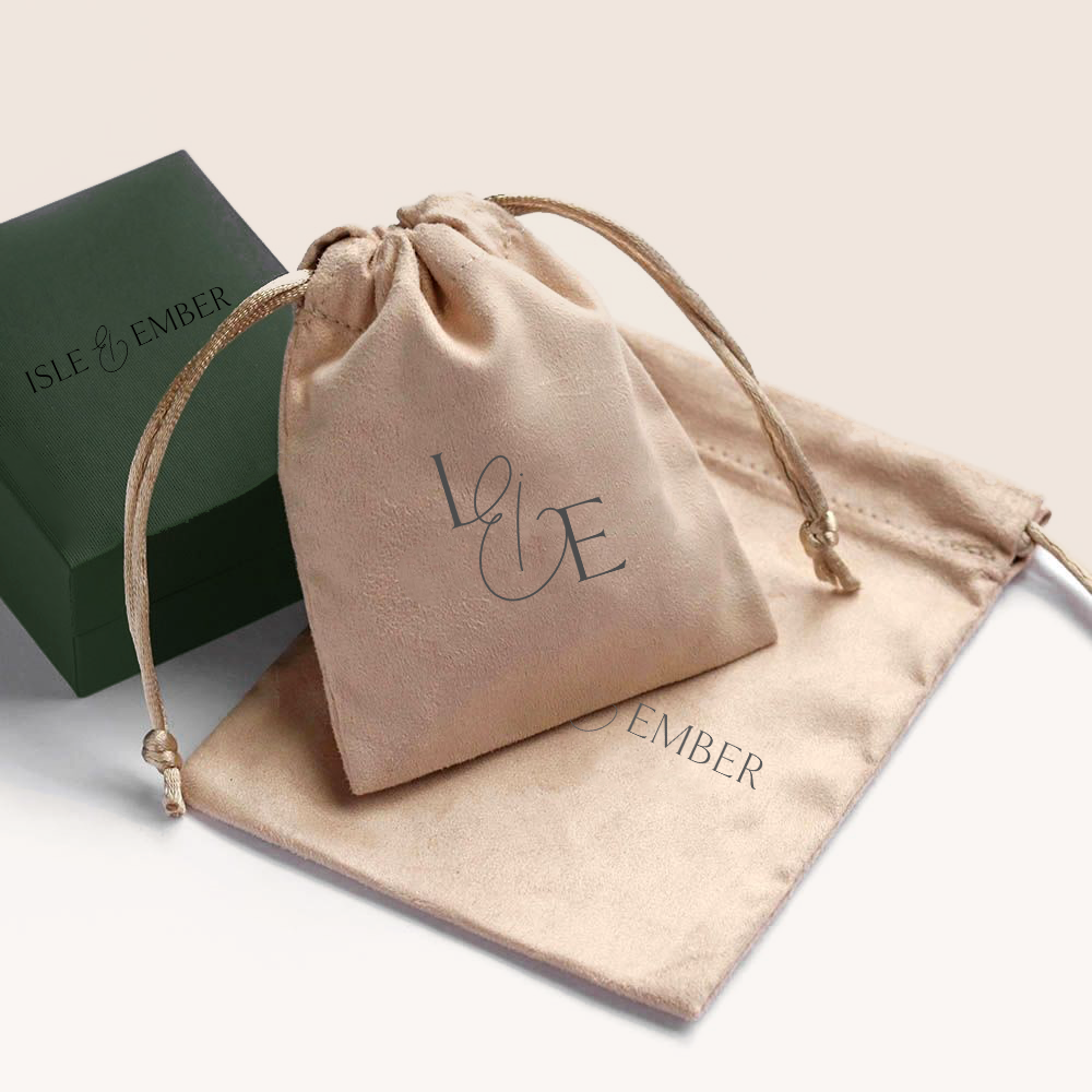
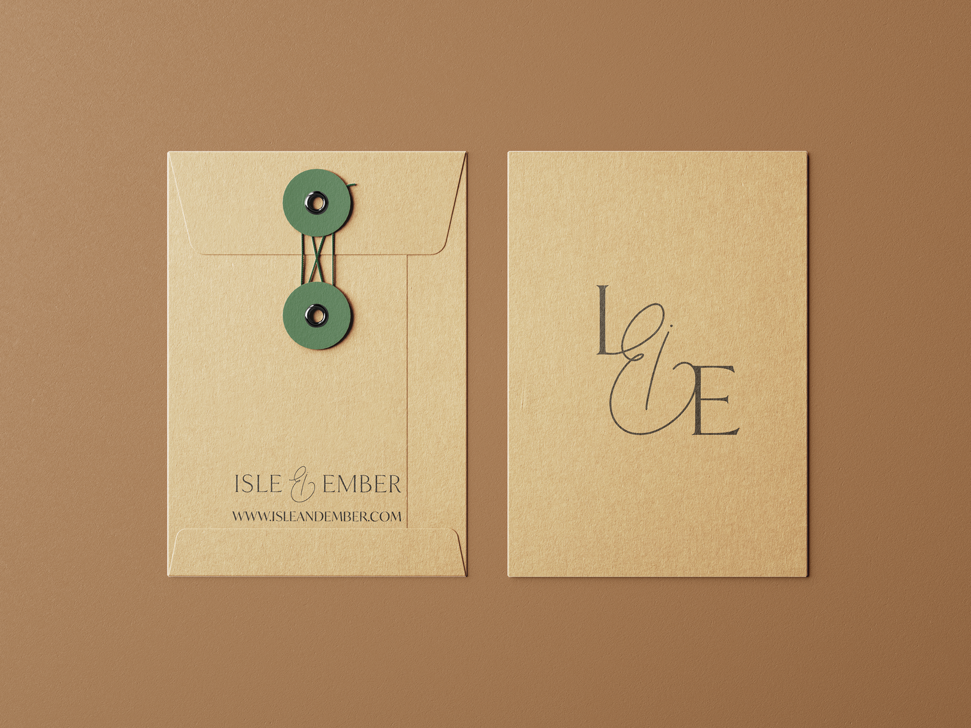
Envisioning how to package the jewellery also needed consideration, and I created product packaging mockups using secondary images and editing them in Photoshop to fit with the Isle & Ember brand.
I decided to use the full logo on packaging such as boxes, and the Initial logo on the inner jewellery pouch, which would be made from sustainable materials such as linen or vegan leather. This packaging utilises the brand colours- Isle green for the box, and Ember Orange or Linen for any fabric packaging.
PRINTED MATERIALS
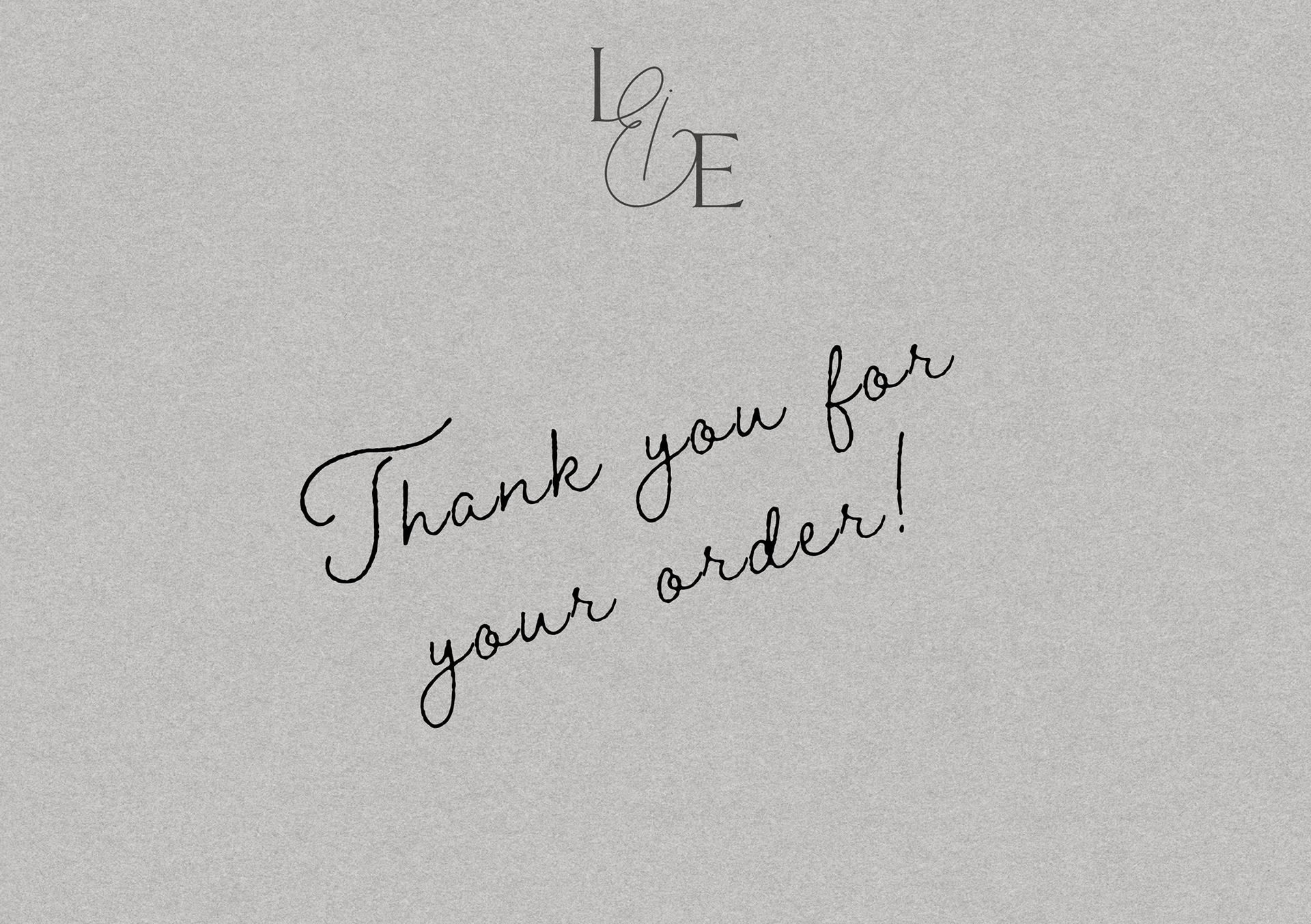
To create these mockups of stationery, stickers and business cards, I used a selection of secondary mock-up templates in which to integrate my packaging designs. Also included is a mock-up of embossing using the logo, as by embossing business cards or other ephemera, the packaging takes on a more luxurious feel, without compromising on the environmental impact.
FRAMEWORK
ITERATIVE DESIGN
The Iterative Design process has been crucial throughout this project. It has been essential to adapt and evolve ideas throughout the design process, reflecting the knowledge I gain through in-depth research and analysis. As this project was also based around a genuine client with the potential for future collaboration, it was important to take into account all client feedback and regularly liaise with them. Communicating with others naturally creates additional needs to re-iterate and redesign based on the opinions and preferences of others, not just of my own instincts. I also tested each prototype throughout their development and would modify them based on feedback to determine effective usability of the brand’s online interface. The naming and logo development for the brand were particularly iterative processes, with rough sketches, presentations and moodboards created and shared with the designer, amongst others, to gage responses before refinement of the outcome.
BRAND IDEALS HONEYCOMB
The Brand Ideals Honeycomb (Wheeler, 2012:29) was a useful reference tool throughout the branding process as it outlines 9 core elements that combine to create a successful brand. While some of the elements are more appropriate to larger, established organisations, even small, new businesses can implement the stages it sets out, and to also plan ahead for other areas that will be more relevant as the brand grows. This framework reminded me of the importance of building a coherent and consistent brand, regardless of scale. Research conducted supported the need for understanding the market, identifying the target audience and knowing the jewellery's competitors. Ensuring the brand I created was clear on its values and its identity were also key elements in building final branding outcomes that can best communicate Isle & Ember.
FINAL OUTCOMES
To view the final outcomes for this project (Brand Guide, website prototype and packaging prototypes) please click the button below.